Herocode Blocks
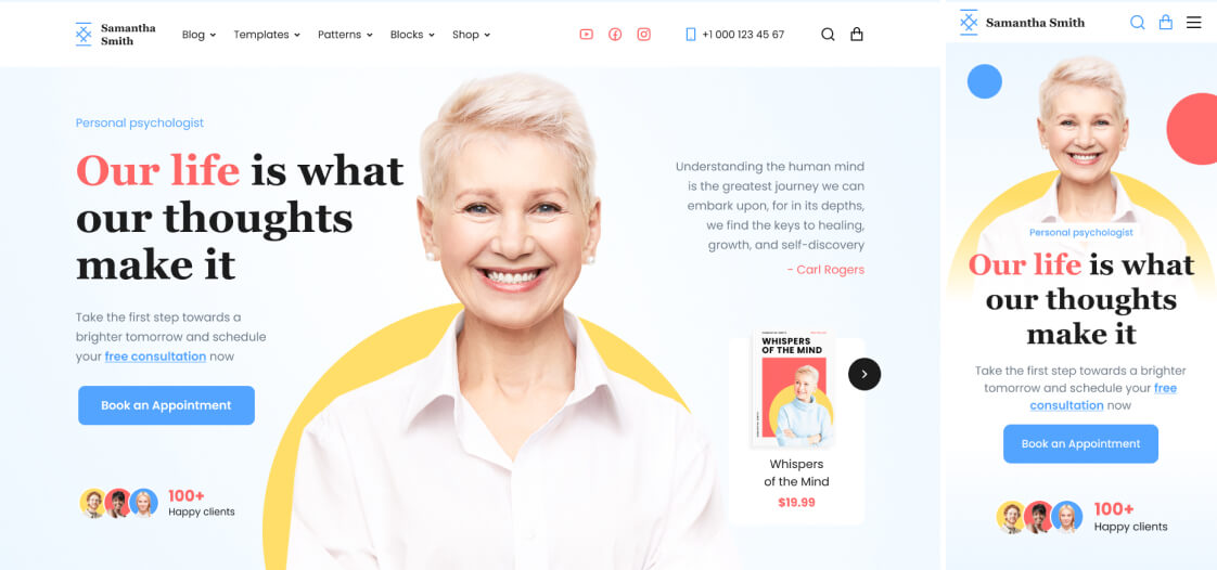
Adaptive Flex & Block
In the Gutenberg editor, this block enhances editing functions. As such, it can be regarded as a basic container for constructing responsive layouts with advanced features.
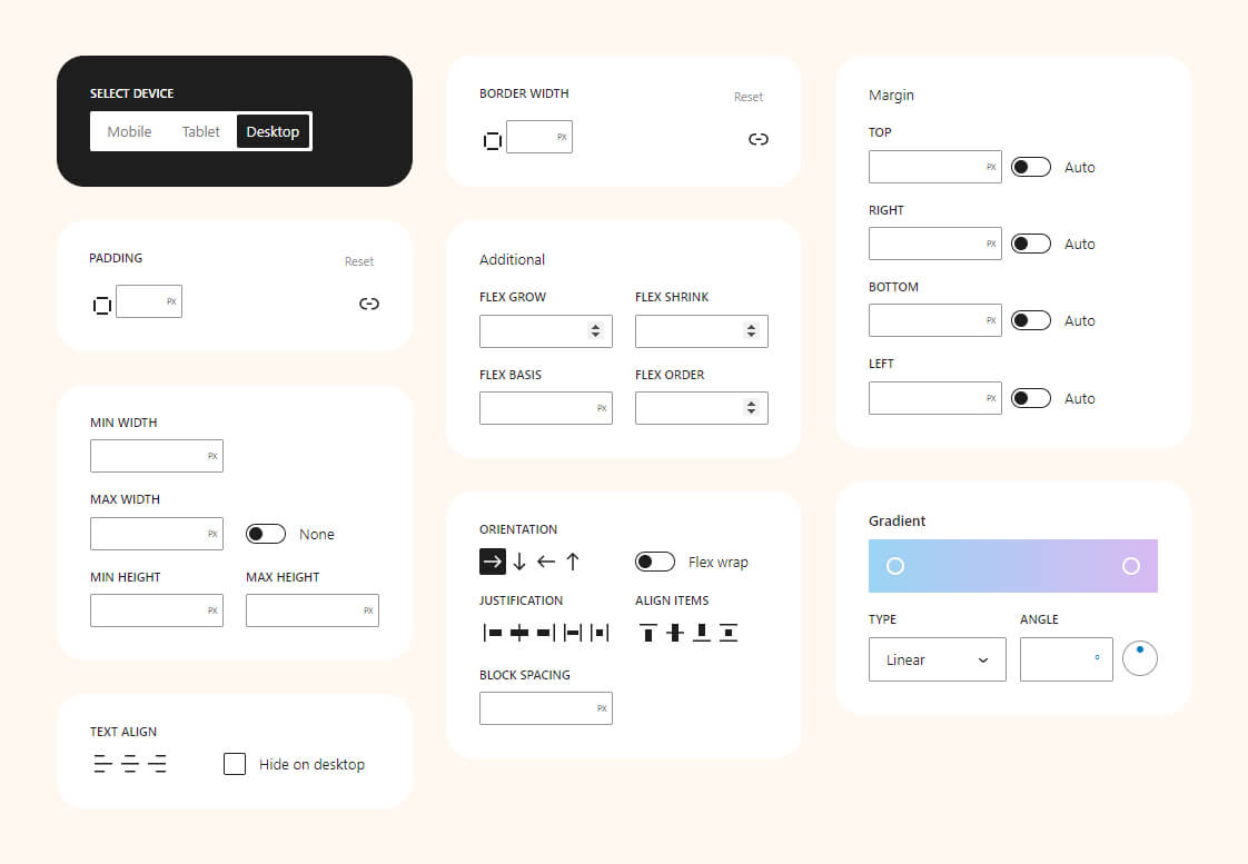
Adaptive settings
Examples
Combined with other Herocode Blocks, it enables efficient page creation in the Gutenberg editor. We’ll showcase examples to inspire fresh ideas.
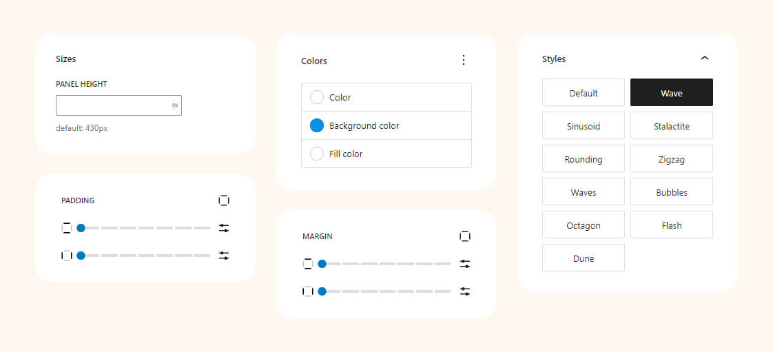
Shape Divider
The block allows adding decorative dividers to sections of a web page. They can be used to create unique and appealing design effects, separating page sections or giving them a distinctive style.
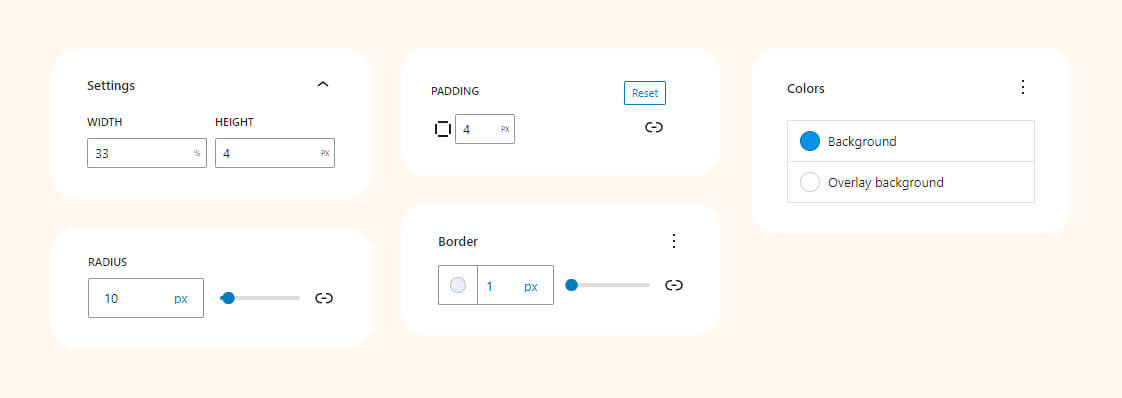
Block settings
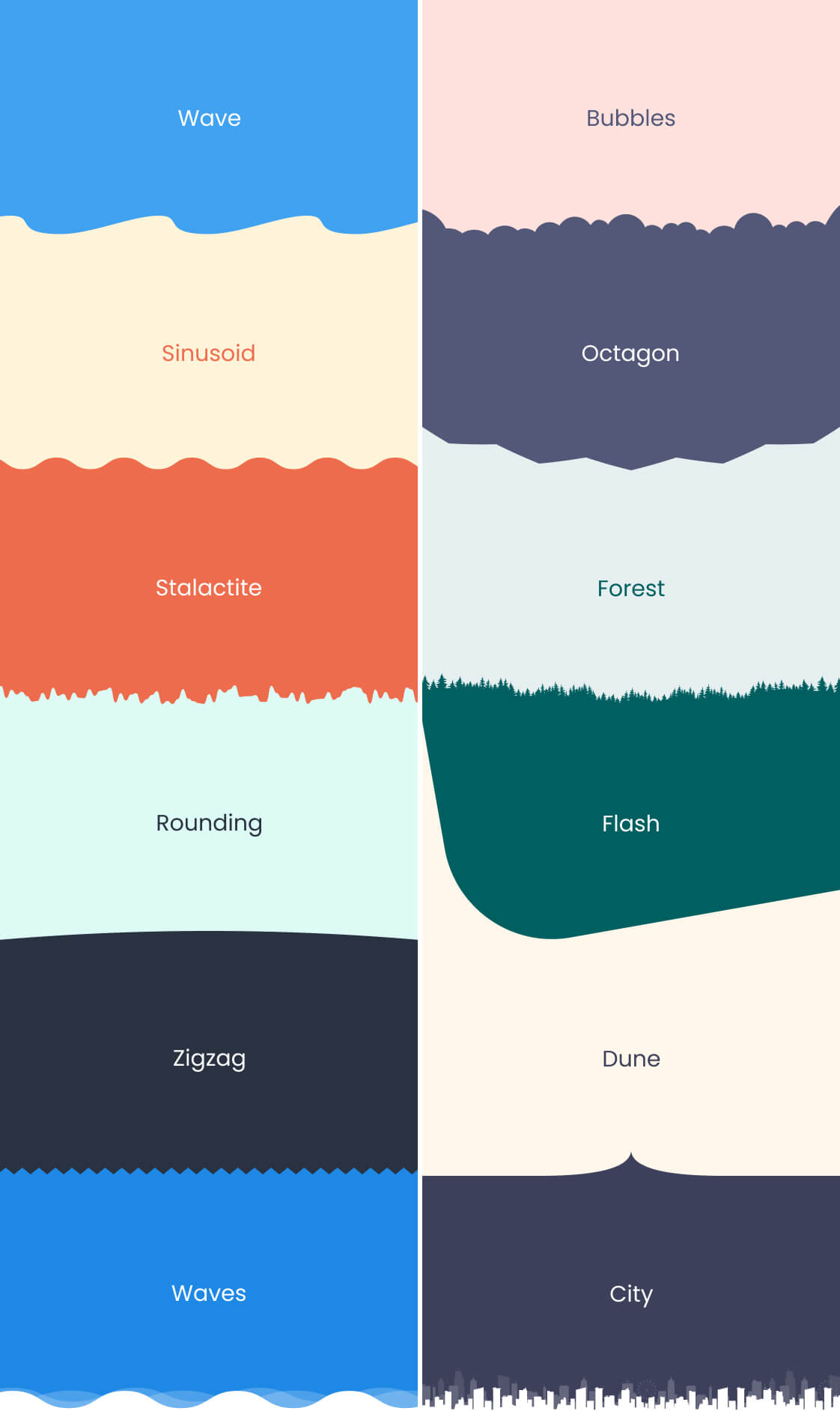
Preview styles
Elevate your design with unique, eye-catching dividers. From waves to angles, these examples demonstrate the versatility and creativity you can bring to your website’s layout.
Adaptive Position
The block empowers you to finely control the CSS ‘position’ property, enabling dynamic placement of elements. Whether you choose ‘static,’ ‘relative,’ ‘absolute,’ or ‘fixed,’ this block ensures seamless integration with your design. Effortlessly optimize layout and enhance user experience by precisely positioning elements on your webpage.
Block settings

Examples
For instance, you can use floating ‘Call back’ button with a fixed position in the bottom-right corner to provide easy access for clients to request a callback, thereby enhancing the user experience on your website.

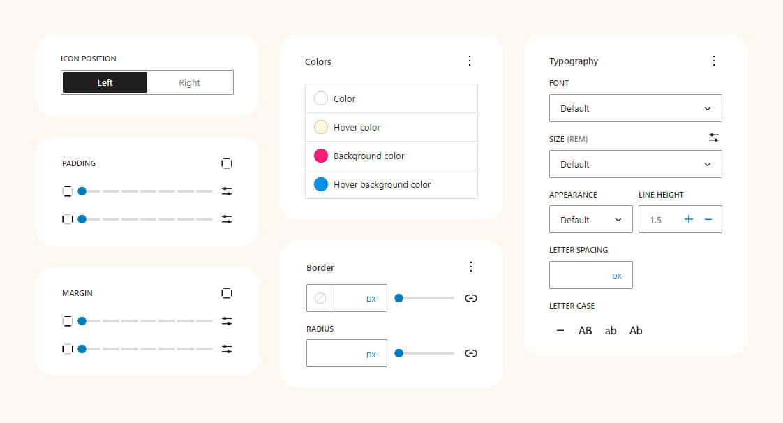
Button with icon
The block facilitates the seamless integration of buttons with icons on your website. With a diverse range of options for customization, you can effortlessly enhance user interaction and design aesthetics, ensuring a visually appealing and engaging user experience.
Block settings
Examples
The examples showcase buttons with icons, offering extensive customization options for diverse designs. From sleek and minimalistic to bold and vibrant, you have the flexibility to create a wide range of visual styles.

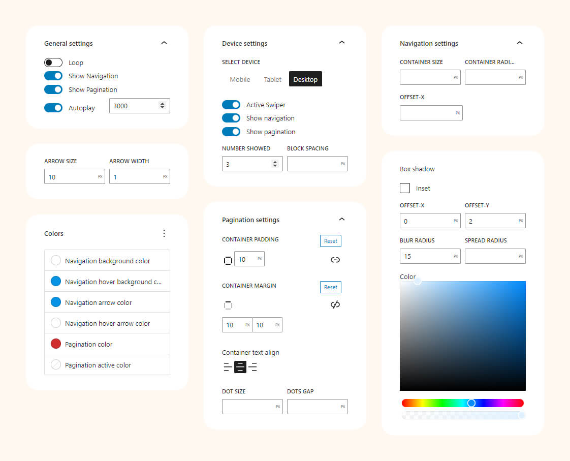
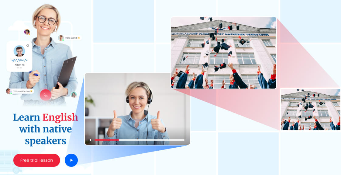
Carousel
The Gutenberg Carousel block presents a versatile solution for displaying images or content in a dynamic, interactive slideshow. With easy configuration and design options, you can create engaging carousels that captivate your audience and make your website visually appealing.
Block settings
Examples
This example demonstrates the use of the Carousel block to create a visually captivating image gallery or content showcase.
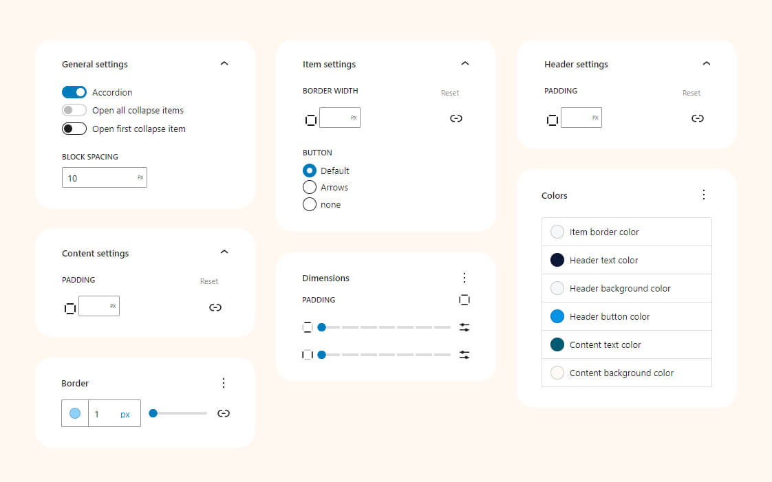
Collapse
Allows you to create interactive content sections that can be expanded or collapsed with a click. It’s perfect for presenting information in a neat, organized manner, providing users with a seamless and engaging reading experience.
Block settings
Examples
This Collapse block design example demonstrates a sleek, user-friendly interface for presenting information.

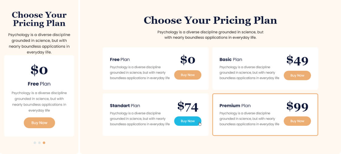
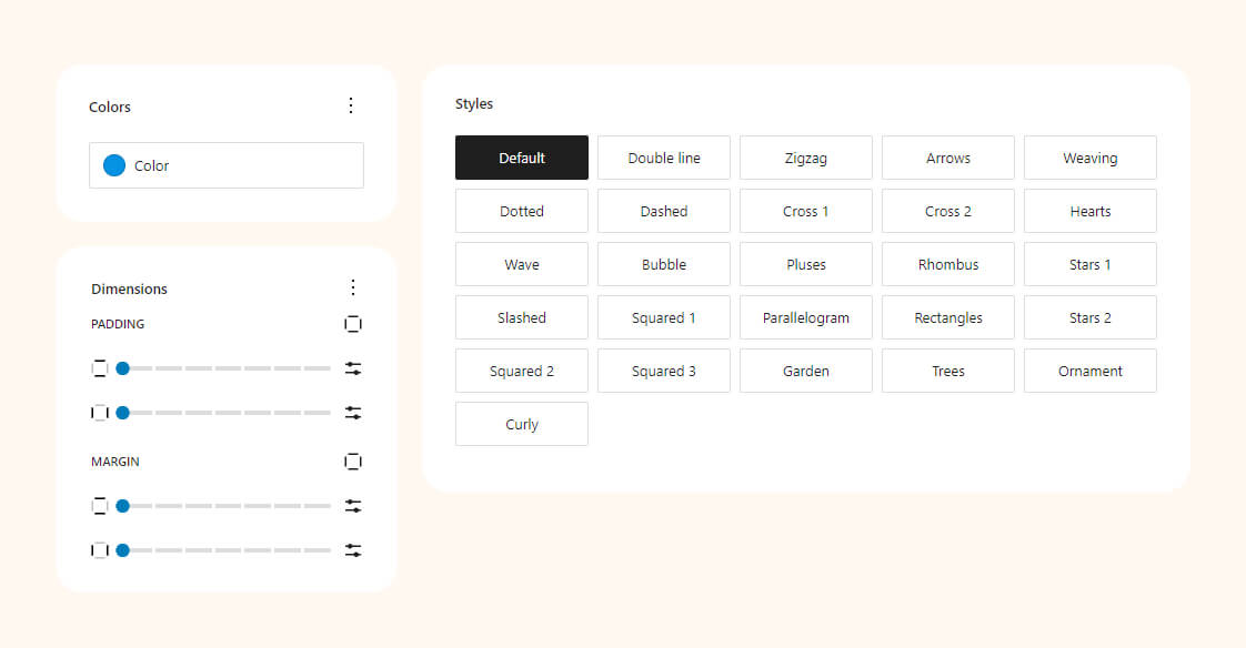
Divider
The block serves as a versatile tool for enhancing page layouts. With 25 styles and an unlimited color palette, it allows you to creatively separate sections, adding visual interest and structure to your content for an engaging and aesthetically pleasing user experience.
Block settings
Examples
This showcase features diverse visual representations of various Divider styles. From elegant lines to intricate patterns, these examples demonstrate the versatility and creativity you can bring to your website’s design, adding a touch of sophistication and structure to your content.

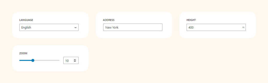
Google Maps
The block allows seamless integration of maps. Customize language, zoom level, and pinpoint locations with ease
Block settings
Examples
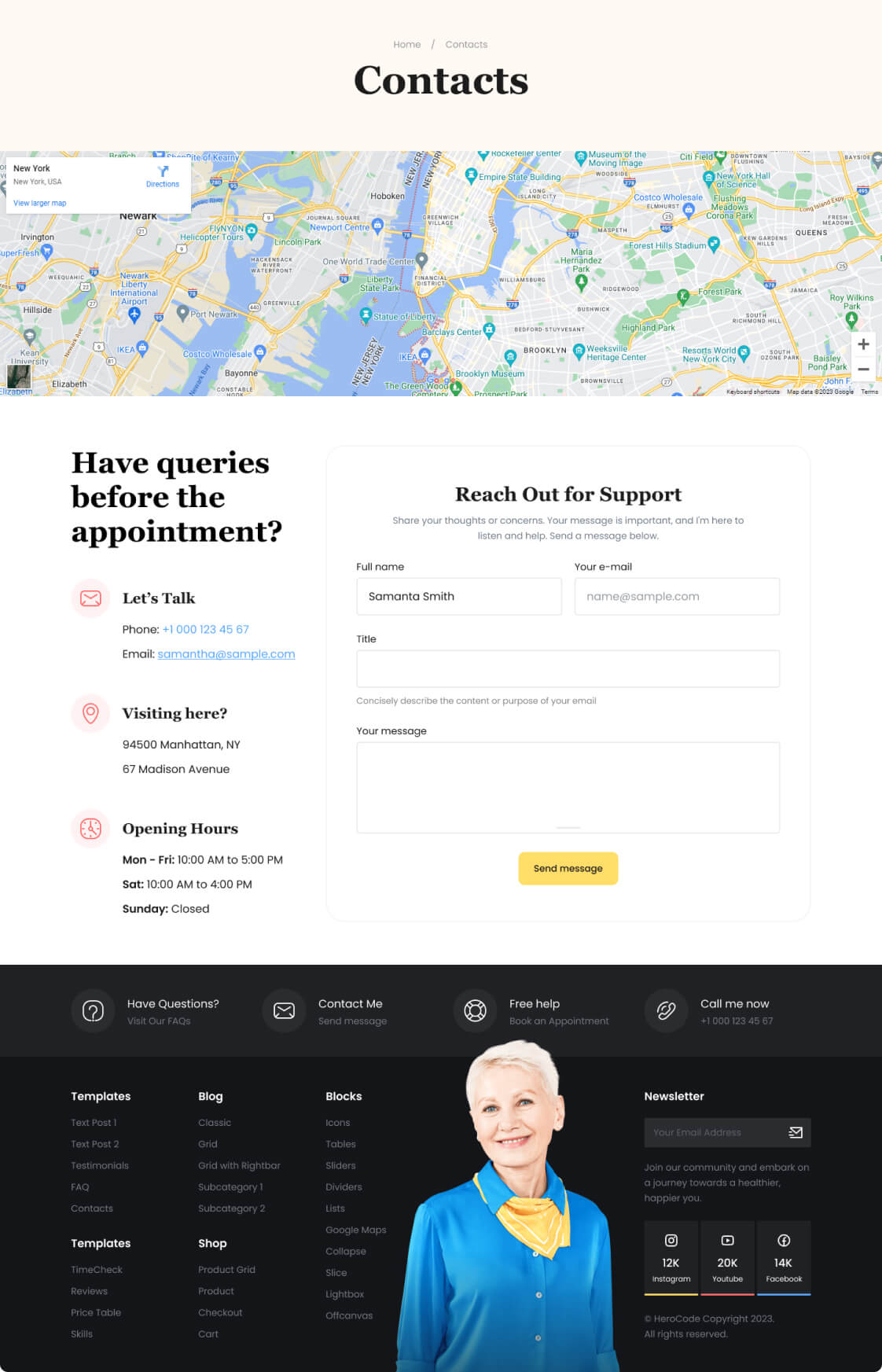
This contact page design example showcases the use of the Google Maps block. It effortlessly integrates an interactive map, providing visitors with precise location information.
Icons Pack
The Gutenberg Icon Block offers seamless integration of over 2500 Remix icons or the option to upload custom icons. With adaptive settings, you can tailor styles based on screen size, ensuring a responsive and visually appealing design that caters to various devices and enhances user interaction.
Block settings
Examples
Experiment with icon settings to enhance the site’s aesthetics, providing an interactive user interface that makes information more engaging and accessible.
Lightbox
An interactive block that allows the user to enlarge images or view videos in a modal window without leaving the current page. It creates a background around the content, drawing attention to the displayed image or video. This provides a more convenient and engaging viewing experience for users.
Block settings
Examples
Lightbox is ideal for showcasing images or videos in a visually appealing manner. It’s commonly used in portfolios, galleries, product pages, and multimedia content sections to provide an interactive and immersive viewing experience.
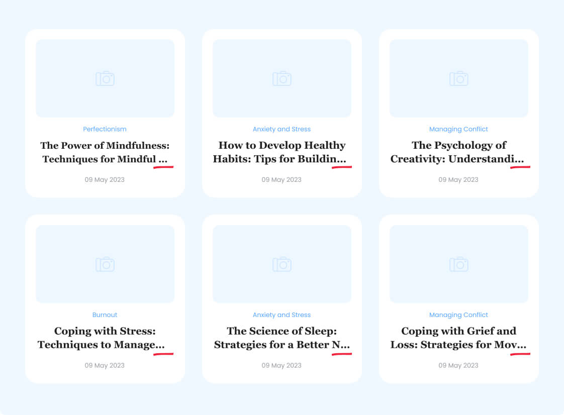
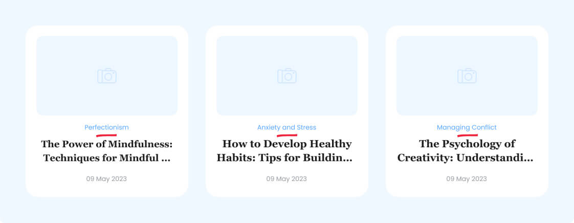
Line Clamp
The block allows limiting the number of lines in a text block and adding an ellipsis (…) to indicate truncated content.
Block settings
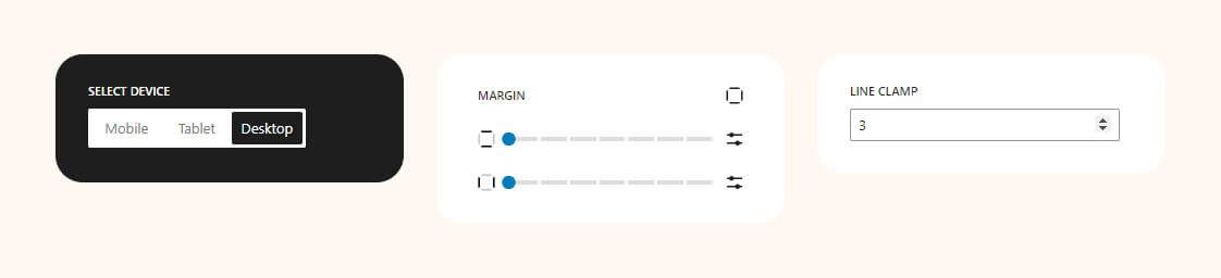
Examples
This is especially useful for creating an aesthetically pleasing appearance in blocks with limited height, such as in news cards or product descriptions.
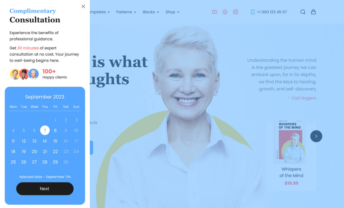
Offcanvas
This is a user interface pattern that involves the emergence of a side panel or container with content from the side or top of the main screen. This allows for hiding additional interface elements to maintain a clean design and provide easy access to them when needed.
Block settings

“>Examples
An online appointment calendar is integrated with the block in this instance. By doing so, the main interface remains clutter-free and easily accessible.
Post Primary Category
It allows users to display and highlight the primary category associated with a specific post. This can be useful for organizing and presenting content on a website, particularly in scenarios where posts may belong to multiple categories but one is designated as the primary or most relevant category. The block provides a straightforward way to emphasize this primary classification within the post’s layout.
Block settings

Examples
One of the use cases for this block is to showcase the primary category within a loop for displaying posts.
Progress Bar
It is used to visually display the progress of a process or task on a web page. This block allows the user to easily see the percentage of completion and assess the current progress. It can be useful for showcasing achievements or displaying levels of task completion.
Block settings
Examples
Tell about your skills and visualize them using our block.

Rating
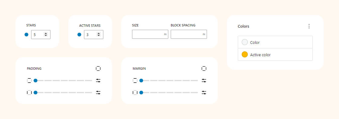
Customize ratings from 1 to 10 stars, providing valuable feedback for products, services, or content.
Block settings
Examples
Employ the rating block to style review cards effectively.

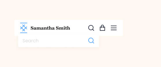
Drop Search
Uncomplicated search widget featuring a floating search form. Perfect for headers with abundant content, making it challenging to display a search field.
Block settings

Frontend preview
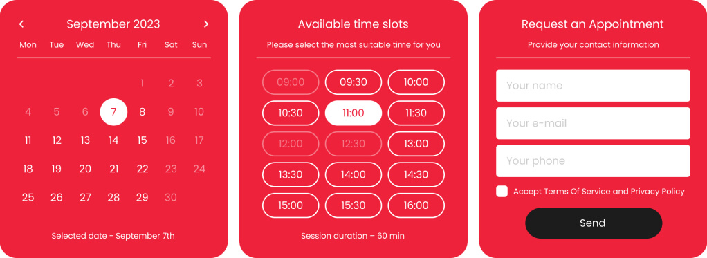
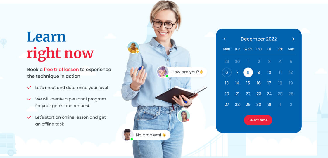
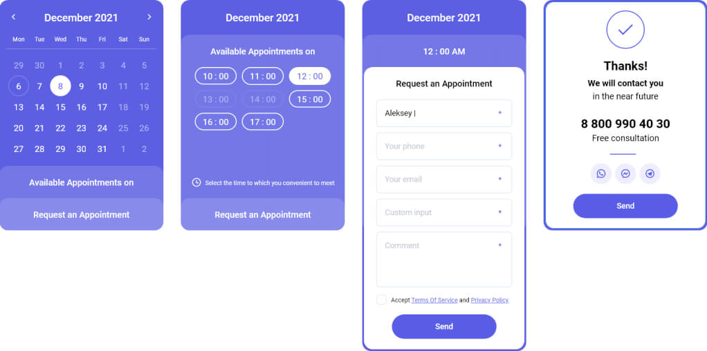
Timecheck
Block for displaying an online booking form. You can insert this form anywhere on your website and allow visitors to schedule appointments online! No need to answer calls or spend time processing messages.
Block settings
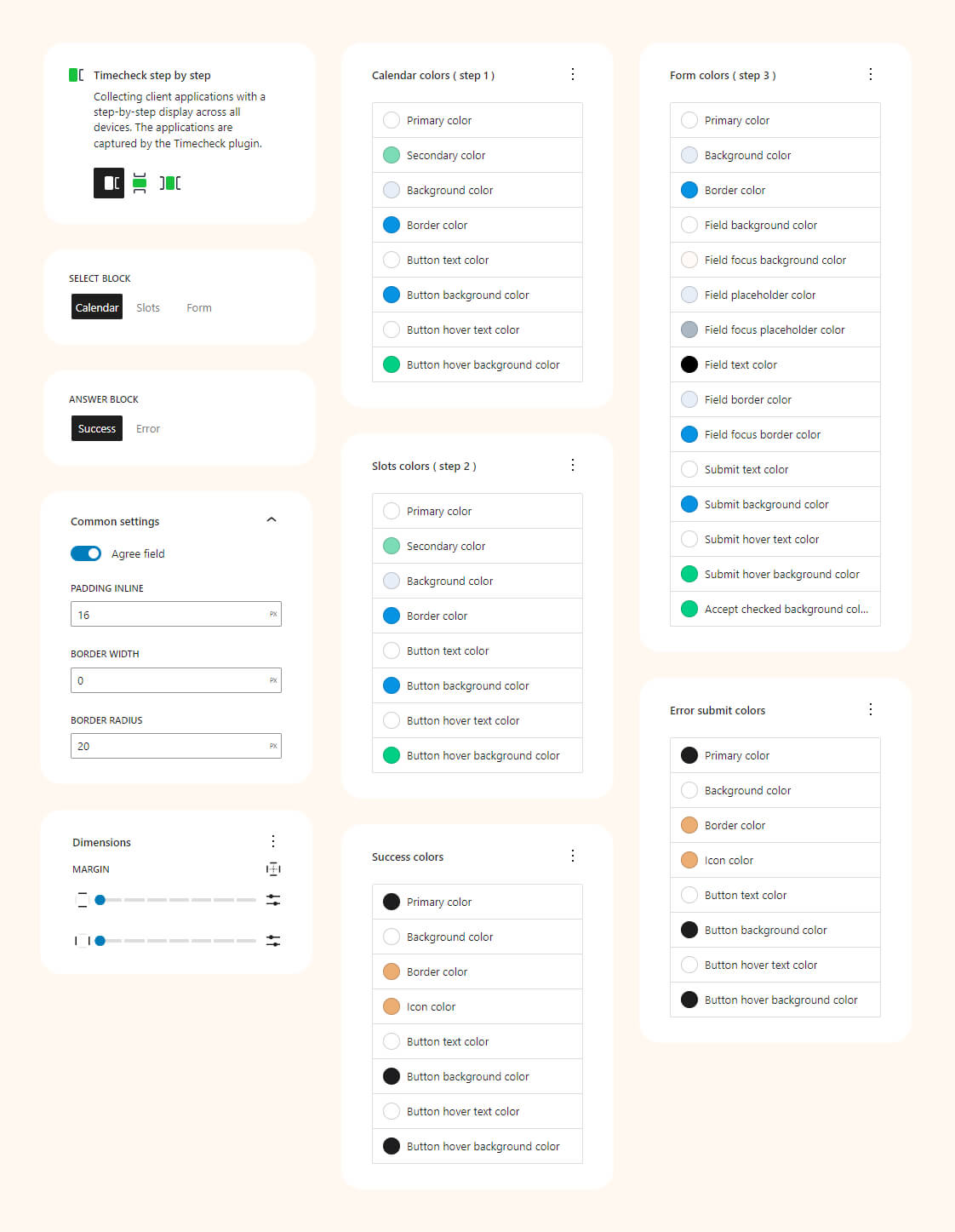
Examples
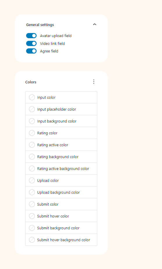
You have three display options for the form: ‘Step by step’, ‘Collapse’, and ‘Inline’. Each offers extensive settings to customize the form to match your website design.
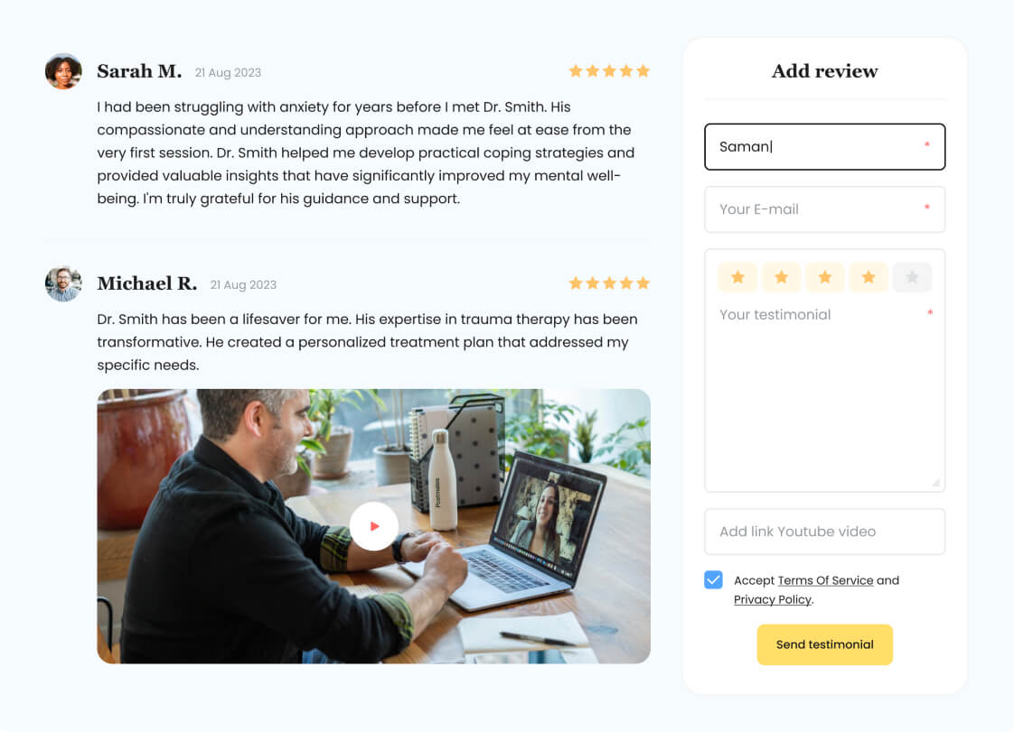
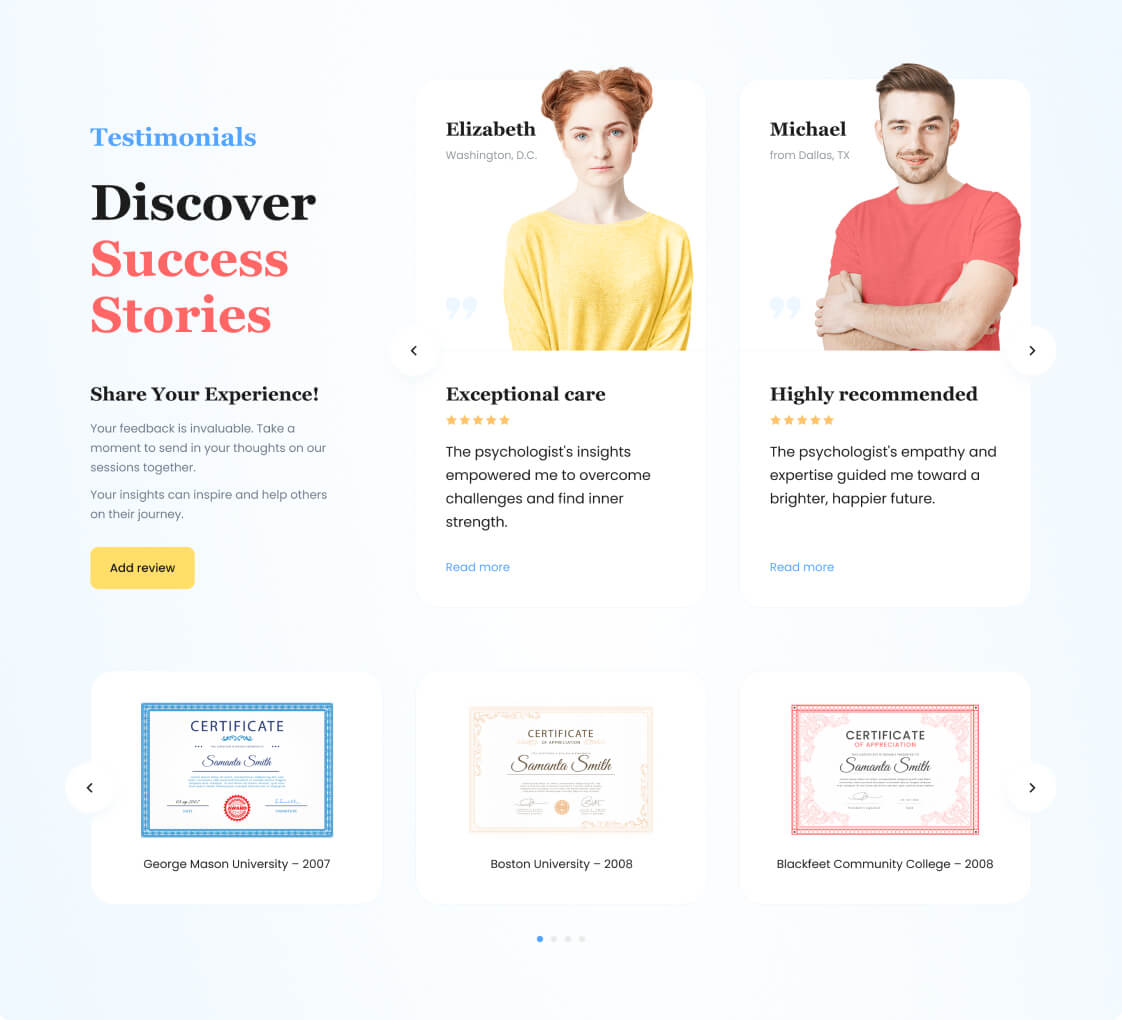
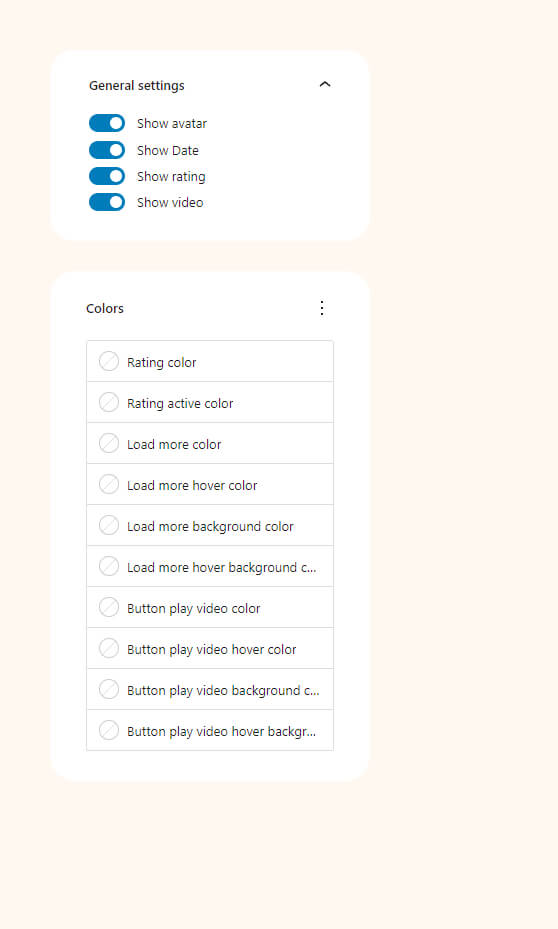
Testimonials
Collect and post customer reviews. Customize testimoials collection form and the list of reviews. Site visitors can also leave video reviews.
Form settings
Loop settings
Examples
Our theme demo content shows an example of how the testimonial block is used. It is possible to use the blocks and customize them to match the design of your website.