HeroMe
3.16.1
Feb 7, 2024
- Bug fix: added a template for the mailchimp form
- Bug fix: added translation strings from php setup files
- Bug fix: changed patterns titles
- Bug fix: updated comment heading in the start skin
- Improvements: added new patterns for localization
- Improvements: added new patterns – share block and related posts
- Improvements: added translate methods to the patterns
- Improvements: added a translation file to the psychologist skin
- Improvements: added a translation file to the start skin
- Improvements: updated text variables
3.14.5
Jan 25, 2024
- Bug fix: added the support border-radius to the image block
- Bug fix: replaced http to https in all files
- Bug fix: updated menu in the start skin
- Bug fix: fixed a few woo bugs after updates
3.12.8
Jan 22, 2024
- Bug fix: images had errors in the browser console related to the image widht and height attributes
- Bug fix: added a figcaption border-radius to the image block
- Bug fix: fixed box-shadow color of the swiper
- Bug fix: w3c errors
- Bug fix: changed the phone number output – without whitespaces
- Bug fix: comments form output if we have not comments
- Bug fix: removed inherit=false from loops
- Bug fix: latest-comment latest-posts core/rss were fixed displaying
- Improvements: added extra large font size
- Improvements: added styles to the sticky post
- Improvements: changed the standart block separator styles
- Improvements: stylized the quote variations
- Improvements: separated styles for rtl
- Improvements: menu appearance
- Improvements: changed the appearance of the core-categories block display
- Improvements: added styles to the standart blocks – arhives categories page-list rss tag-cloud
- Improvements: added styles to the standart blocks – calendar, latest-posts
- Improvements: have finished search block styles
- Some php code improvements
3.6.32
Jan 6, 2024
- Bug fix: removed empty links from templates
- Bug fix: removed width & height from all wp-block-image
- Bug fix: fixed a few bugs for the dark mode
- Bug fix: added styles to the woo product review form
- Improvements: separated the style.css into blocks
3.6.25
Dec 23, 2023
- Bug fix: compressed pictures
- Bug fix: fixed the subdomain in media links
- Bug fix: woo start rating – fixed border-width
- Updated skin – some improvements
- Update core-comments block styles
- Improvement: added width and height attributes to imgs in the both skins
3.6.22
Dec 16, 2023
- Bug fix: changed sidebar buttons font-size
- Bug fix: fixed pagination arrow bgcolor
- Bug fix: fixed links in the theme patterns
- Bug fix: fixed submenu link color
- Updated herome skin
- Added dark mode
- Some styles improvements
- Added translation files
- Added support theme color gradient
3.6.17
Dec 5, 2023
- Configured theme.json
- Created templates, part, patterns
- The styles and script that theme uses are written
- The styles and script that woo uses are written
- The styles and script that mailchimp uses are written
- The styles and script that contact form 7 uses are written
- The styles and script that yoast uses are written
- Upload all media sources
- Added commentaries form validation
- Added RTL support
3.0.0
Sep 27, 2023
- First release of completely rebuilt version 3
Adaptive Flex & Block
In the Gutenberg editor, this block enhances editing functions. As such, it can be regarded as a basic container for constructing responsive layouts with advanced features.
Adaptive settings
Examples
Combined with other Herocode Blocks, it enables efficient page creation in the Gutenberg editor. We’ll showcase examples to inspire fresh ideas.
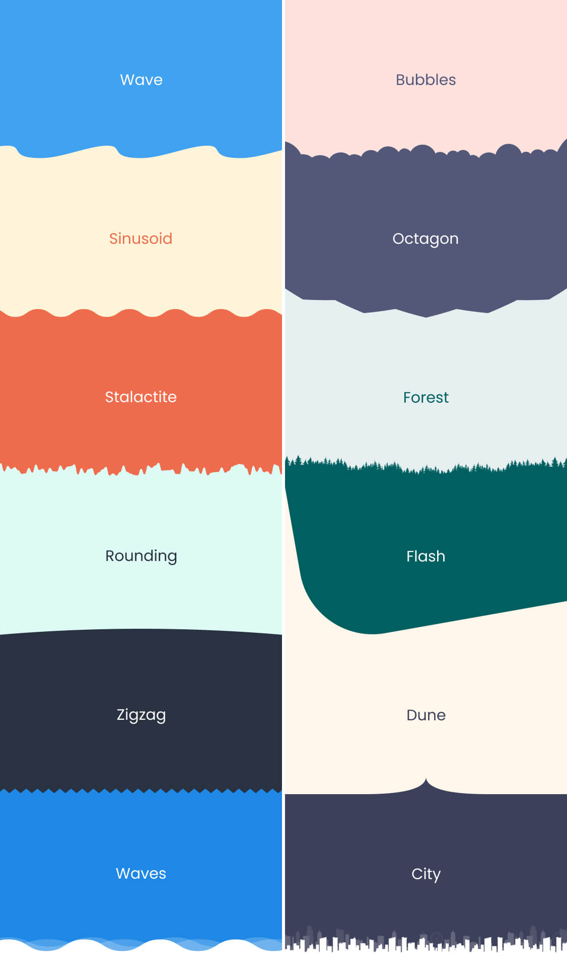
Shape Divider
The block allows adding decorative dividers to sections of a web page. They can be used to create unique and appealing design effects, separating page sections or giving them a distinctive style.
Block settings
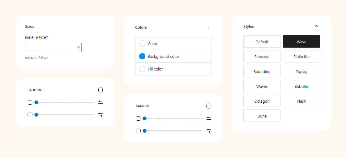
Preview styles
Elevate your design with unique, eye-catching dividers. From waves to angles, these examples demonstrate the versatility and creativity you can bring to your website’s layout.
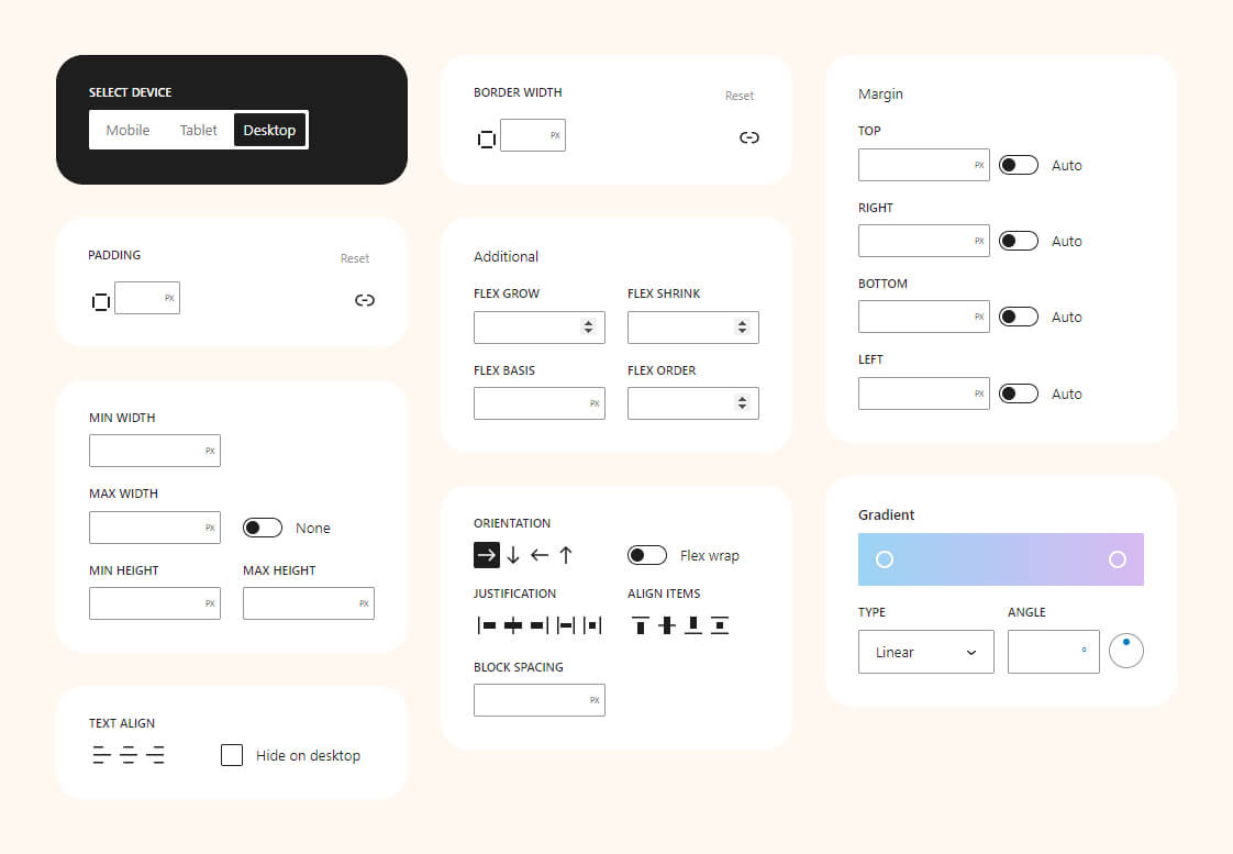
Adaptive Position
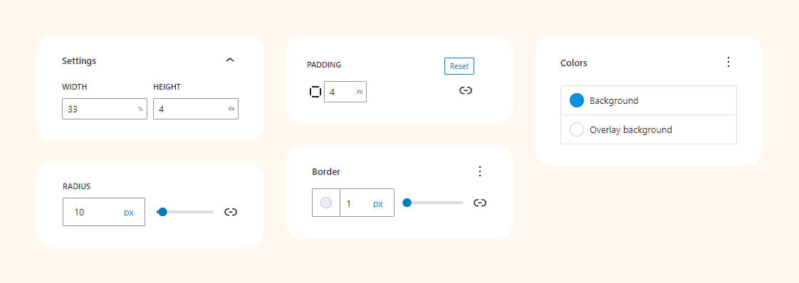
The block empowers you to finely control the CSS ‘position’ property, enabling dynamic placement of elements. Whether you choose ‘static,’ ‘relative,’ ‘absolute,’ or ‘fixed,’ this block ensures seamless integration with your design. Effortlessly optimize layout and enhance user experience by precisely positioning elements on your webpage.
Block settings

Examples
For instance, you can use floating ‘Call back’ button with a fixed position in the bottom-right corner to provide easy access for clients to request a callback, thereby enhancing the user experience on your website.

Button with icon
The block facilitates the seamless integration of buttons with icons on your website. With a diverse range of options for customization, you can effortlessly enhance user interaction and design aesthetics, ensuring a visually appealing and engaging user experience.
Block settings
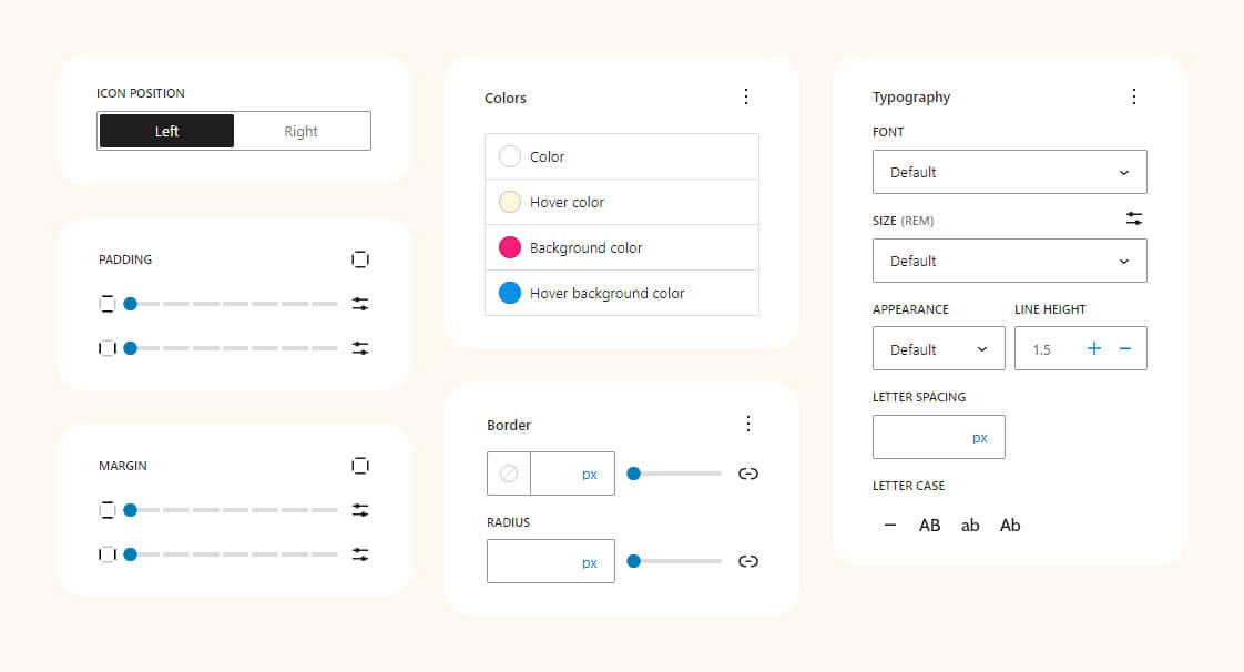
Examples
The examples showcase buttons with icons, offering extensive customization options for diverse designs. From sleek and minimalistic to bold and vibrant, you have the flexibility to create a wide range of visual styles.

Carousel
The Gutenberg Carousel block presents a versatile solution for displaying images or content in a dynamic, interactive slideshow. With easy configuration and design options, you can create engaging carousels that captivate your audience and make your website visually appealing.
Block settings
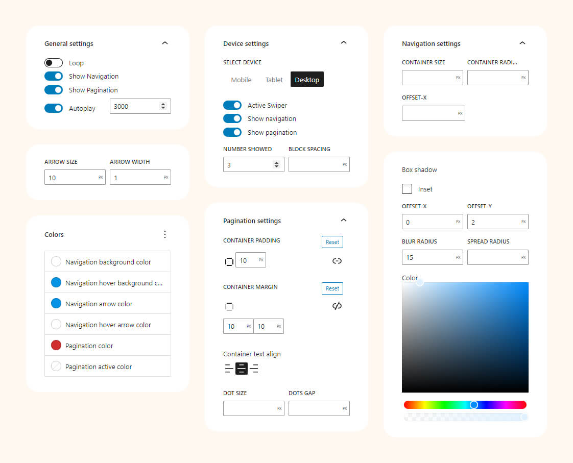
Examples
This example demonstrates the use of the Carousel block to create a visually captivating image gallery or content showcase.
Collapse
Allows you to create interactive content sections that can be expanded or collapsed with a click. It’s perfect for presenting information in a neat, organized manner, providing users with a seamless and engaging reading experience.
Block settings
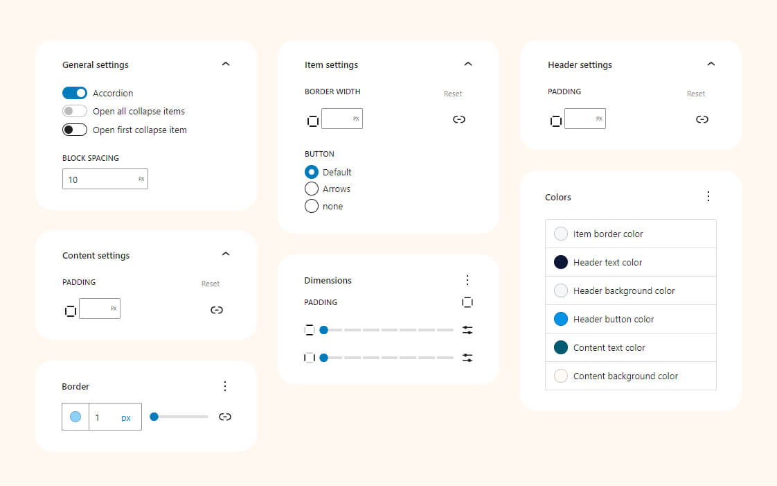
Examples
This Collapse block design example demonstrates a sleek, user-friendly interface for presenting information.

Divider
The block serves as a versatile tool for enhancing page layouts. With 25 styles and an unlimited color palette, it allows you to creatively separate sections, adding visual interest and structure to your content for an engaging and aesthetically pleasing user experience.
Block settings
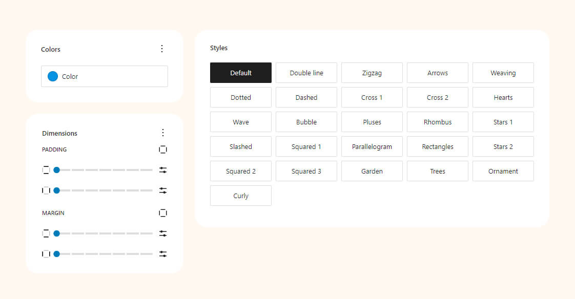
Examples
This showcase features diverse visual representations of various Divider styles. From elegant lines to intricate patterns, these examples demonstrate the versatility and creativity you can bring to your website’s design, adding a touch of sophistication and structure to your content.

Google Maps
The block allows seamless integration of maps. Customize language, zoom level, and pinpoint locations with ease
Block settings
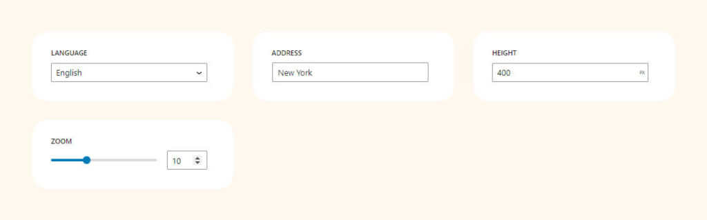
Examples
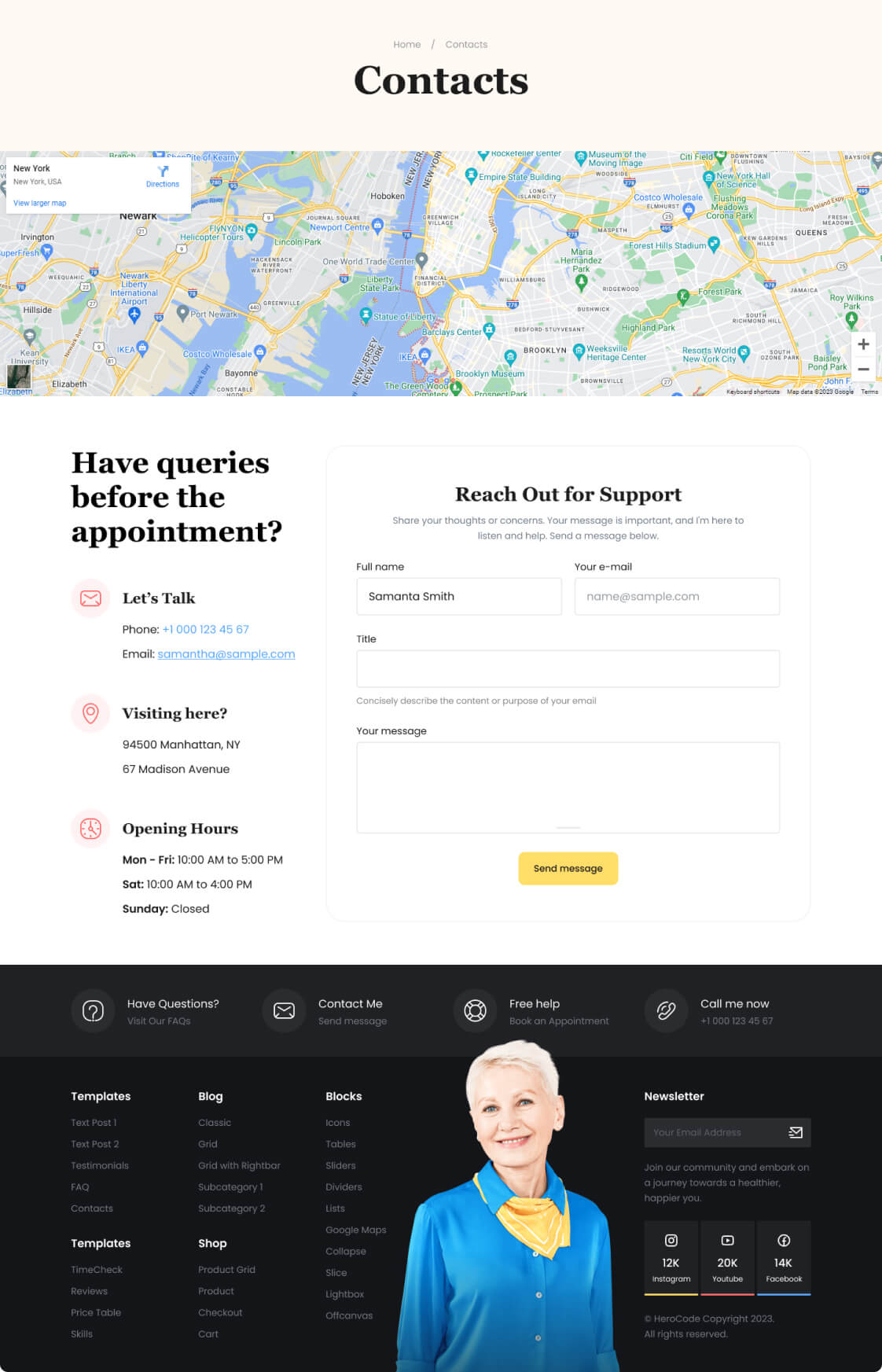
This contact page design example showcases the use of the Google Maps block. It effortlessly integrates an interactive map, providing visitors with precise location information.
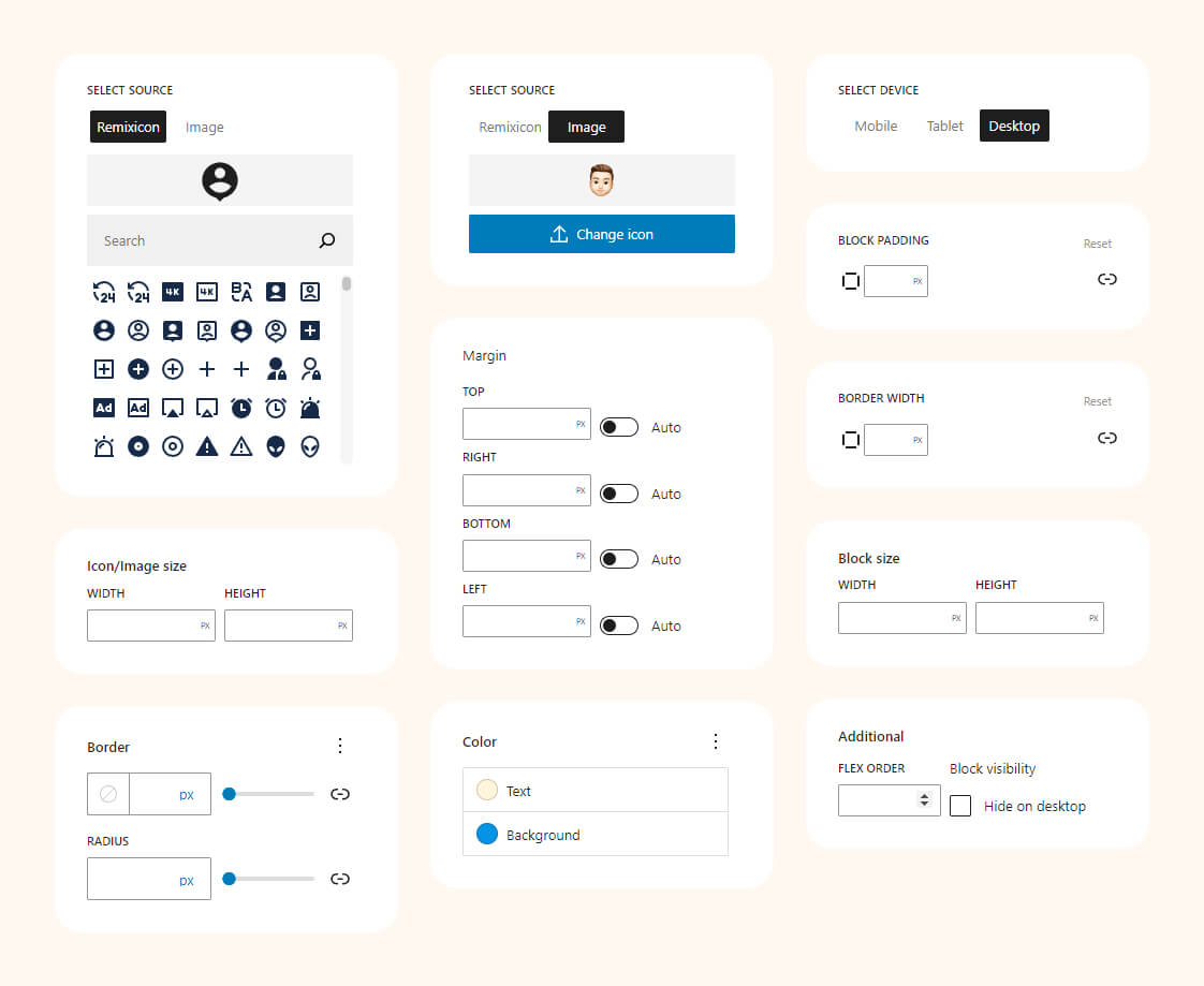
Icons Pack
The Gutenberg Icon Block offers seamless integration of over 2500 Remix icons or the option to upload custom icons. With adaptive settings, you can tailor styles based on screen size, ensuring a responsive and visually appealing design that caters to various devices and enhances user interaction.
Block settings
Examples
Experiment with icon settings to enhance the site’s aesthetics, providing an interactive user interface that makes information more engaging and accessible.
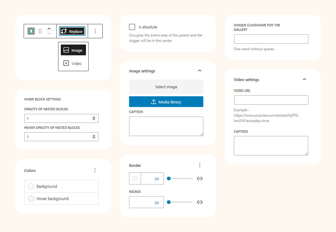
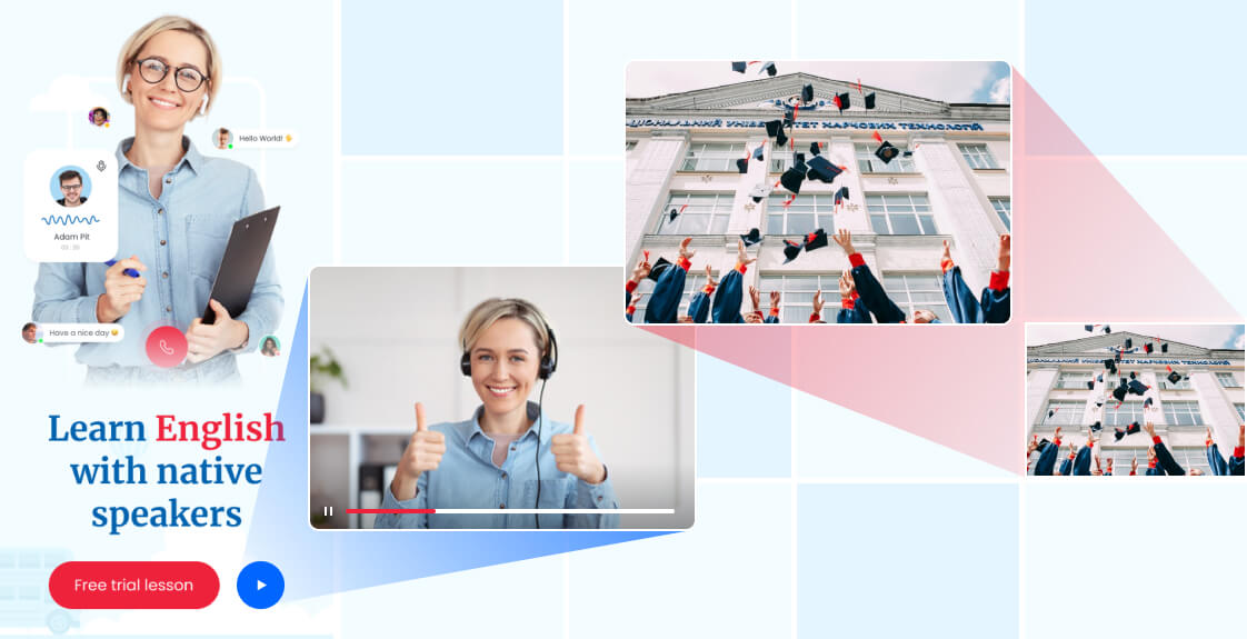
Lightbox
An interactive block that allows the user to enlarge images or view videos in a modal window without leaving the current page. It creates a background around the content, drawing attention to the displayed image or video. This provides a more convenient and engaging viewing experience for users.
Block settings
Examples
Lightbox is ideal for showcasing images or videos in a visually appealing manner. It’s commonly used in portfolios, galleries, product pages, and multimedia content sections to provide an interactive and immersive viewing experience.
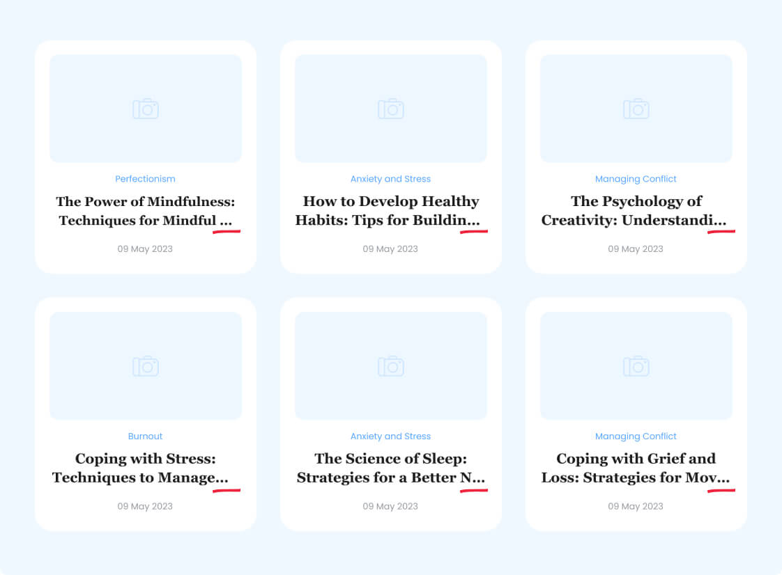
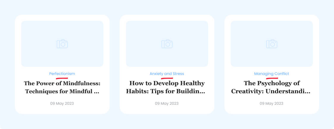
Line Clamp
The block allows limiting the number of lines in a text block and adding an ellipsis (…) to indicate truncated content.
Block settings
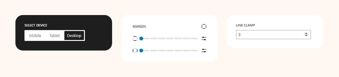
Examples
This is especially useful for creating an aesthetically pleasing appearance in blocks with limited height, such as in news cards or product descriptions.
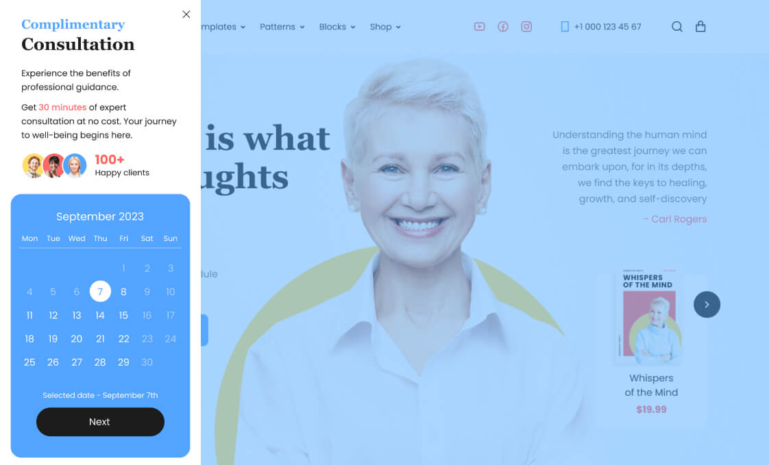
Offcanvas
This is a user interface pattern that involves the emergence of a side panel or container with content from the side or top of the main screen. This allows for hiding additional interface elements to maintain a clean design and provide easy access to them when needed.
Block settings

“>Examples
An online appointment calendar is integrated with the block in this instance. By doing so, the main interface remains clutter-free and easily accessible.
Post Primary Category
It allows users to display and highlight the primary category associated with a specific post. This can be useful for organizing and presenting content on a website, particularly in scenarios where posts may belong to multiple categories but one is designated as the primary or most relevant category. The block provides a straightforward way to emphasize this primary classification within the post’s layout.
Block settings

Examples
One of the use cases for this block is to showcase the primary category within a loop for displaying posts.
Progress Bar
It is used to visually display the progress of a process or task on a web page. This block allows the user to easily see the percentage of completion and assess the current progress. It can be useful for showcasing achievements or displaying levels of task completion.
Block settings
Examples
Tell about your skills and visualize them using our block.

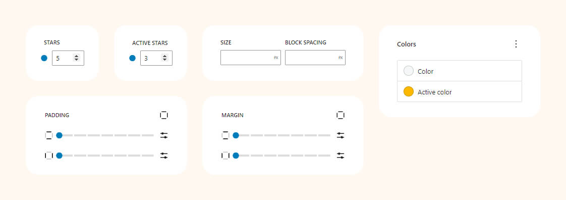
Rating
Customize ratings from 1 to 10 stars, providing valuable feedback for products, services, or content.
Block settings
Examples
Employ the rating block to style review cards effectively.

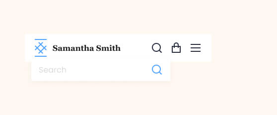
Drop Search
Uncomplicated search widget featuring a floating search form. Perfect for headers with abundant content, making it challenging to display a search field.
Block settings

Frontend preview
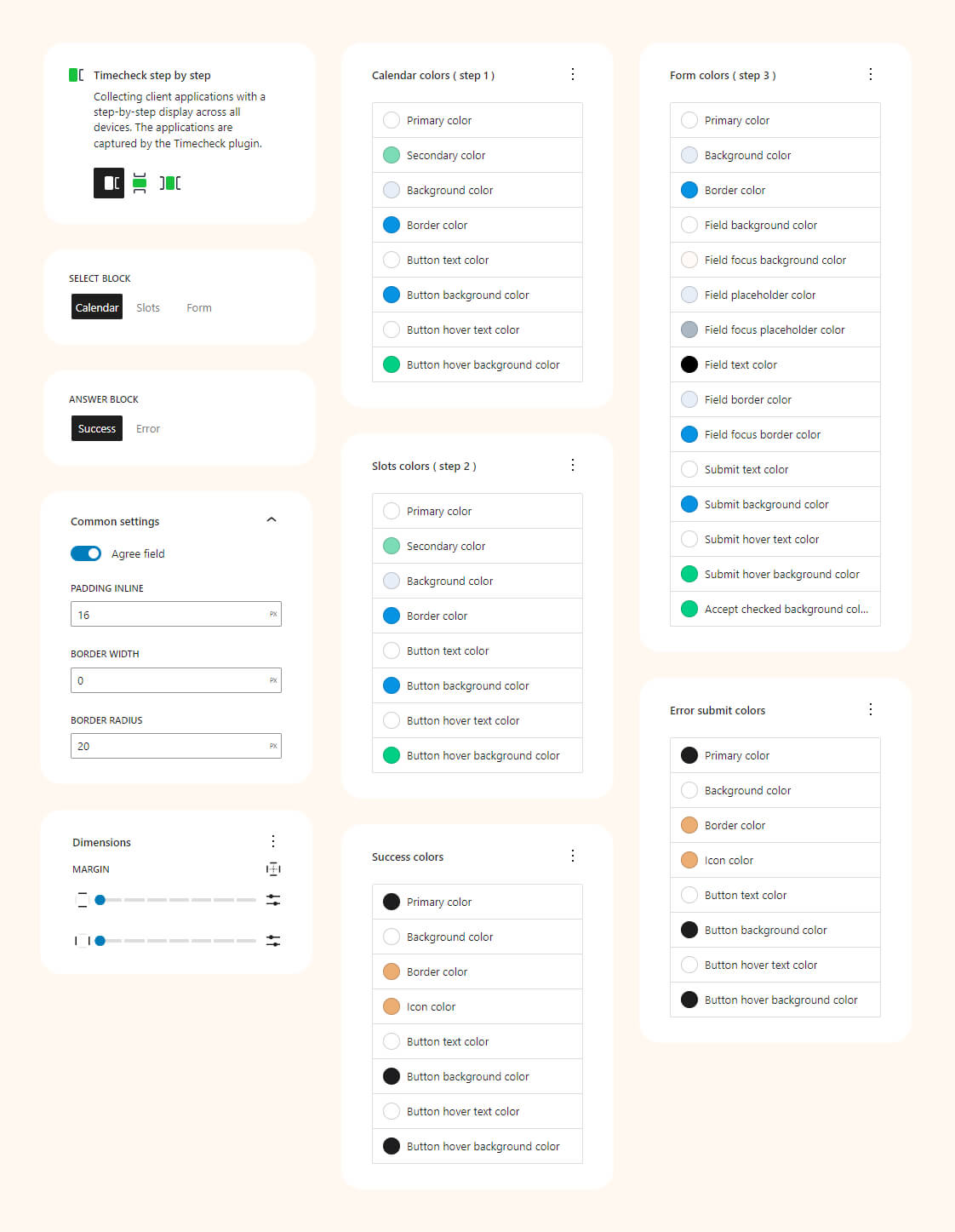
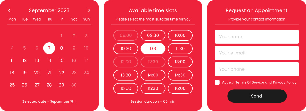
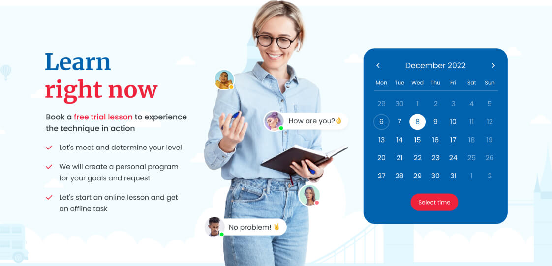
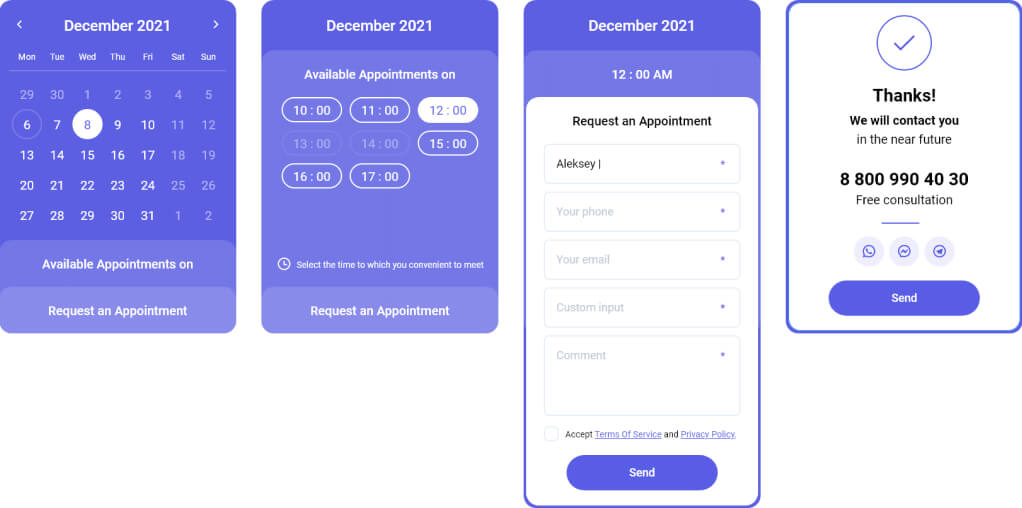
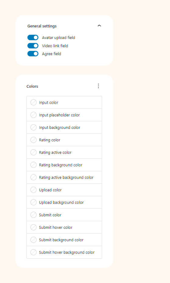
Timecheck
Block for displaying an online booking form. You can insert this form anywhere on your website and allow visitors to schedule appointments online! No need to answer calls or spend time processing messages.
Block settings
Examples
You have three display options for the form: ‘Step by step’, ‘Collapse’, and ‘Inline’. Each offers extensive settings to customize the form to match your website design.
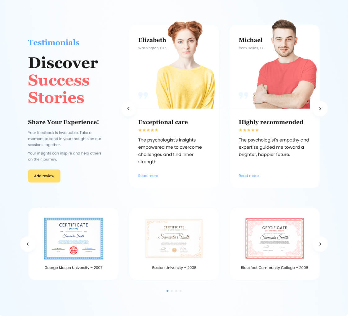
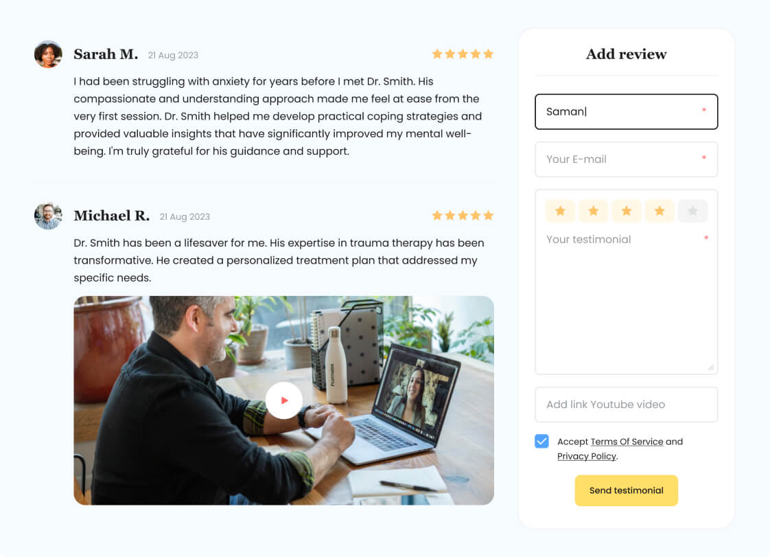
Testimonials
Collect and post customer reviews. Customize testimoials collection form and the list of reviews. Site visitors can also leave video reviews.
Form settings
Loop settings
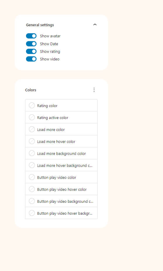
Examples
Our theme demo content shows an example of how the testimonial block is used. It is possible to use the blocks and customize them to match the design of your website.
Translation with “Loca Translate”
The easiest way of translating our theme is by using the Loco Translate plugin. The best news thta Loco Translate WordPress Plugin is a free and can be installed from the default repository of WordPress.
Required theme translation files or static strings are available in the HeroMe theme. Therefore, in this manual, we will consider how to translate required theme translation files and keep translations up to date in these HeroMe theme in future.
Also, it is possible to translate our Theme using any other plugin which you can find in WordPress Plugin Repository. Best news that principles of translation are the same im most plugins.
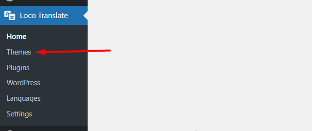
Install Loco Translate
To install the plugin, go to Dashboard and find the Plugins section from the left menu and choose Add New.
Dashboard -> Plugins -> Add new.
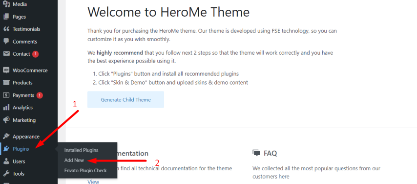
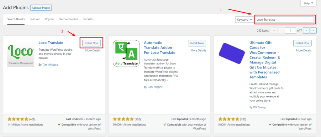
On the opened page, you need to search Loco Translate, install, and activate it.
Create HeroMe Theme Translate File
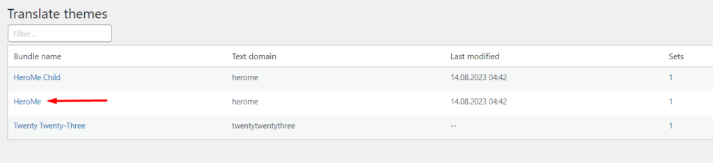
After installing and activating the translating plugin, find in WordPress admin panel Local Translate menu ago to Loco Translate -> Themes.
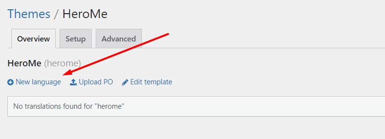
On the opened page choose HeroMe Theme. Now, from here you can create your own language to translate the not editable content of the theme.
Create a desirable language by clicking New language.
Most important!
It is required to store the translation file in “/wp-content/languages/themes/herome/languages folder to keep translation during the theme updates.

After clicking the Start Translation button, you will be directed to the Loco Translate editor where you can start translating the theme strings.

Once you have done with your language translation the translated files can be found in ../wp-content/languages/themes That’s how it is done!
Update Herome Theme Translate File
The first thing to do update theme language is to update the main language file, where all the theme strings are stored. Go to the Dashboard > Loco Translate > Themes > Herome and choose Edit template.
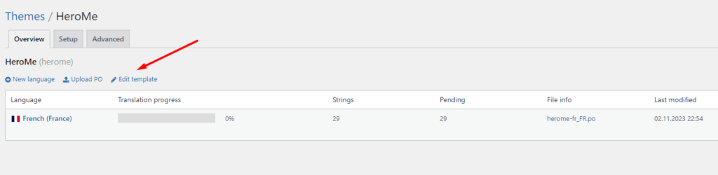
Click on the Sync button to merge new strings from the source code to the main language file.
Warning: This is NOT a translation file. Manual editing of source strings is not recommended.

Click on the Save button to save the new strings.

Go to the list of the translation files for updating the needed translations and the same up instructions. Select your translation file and click on the Sync button and Save changes.
Translating with “Poedit”
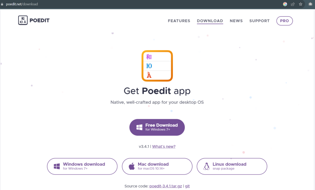
Using Poedit to translate your WordPress themes and plugins is remarkably simple once you’ve installed the tool. For this tutorial, we’re going to be using the free version of Poedit. There’s also a premium version available, including translation ‘suggestions’ and semi-automatic localization. However, if you just want a tool to simplify manual translations, the free version of Poedit will do. You can download this program by this link Poedit.
You can use Poedit to pull all the strings from any plugin or theme you’re working on and use this to generate a POT file. To do so, open Poedit and go to File -> New.
The program will ask you to select the language you want to generate a new file for. Once you’ve done this, on the next screen click on Extract from sources:

From here, set a name for your project under Translation properties and confirm the language you chose earlier:
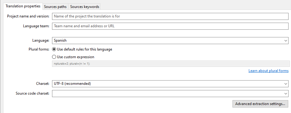
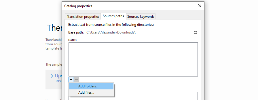
Confirm the changes to the project, then go to File -> Save. Poedit requires you to save the project before you can move on. After you do so, reopen the Extract from sources window and this time, go to Sources paths.
Here is where you tell Poedit which files and folders to look into to extract their text strings. Your plugin or theme should have its own folder, so click the + icon under Base path and select it:
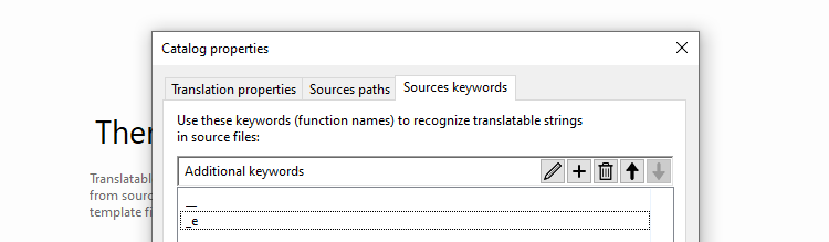
After you select your theme or plugin’s folder, go to the Sources keywords tab and look for the + button there. Click it and add the following two keywords:
- __
- _e
- esc_html__
- esc_html_e
- esc_attr_e
- etc.
The full list you can find here.
The selection should look similar to the following:
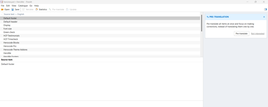
Click on OK and Poedit will start extracting all the text strings it can find. Once the process is complete, you’ll end up with a list similar to the following:

In the next step, we’ll show you how to translate this text. Before moving on, close Poedit and find the project file you just set up. It should be a PO file, but you’ll want to rename it to a POT file.
This is because we want to use the file as the source for all your translations. Poedit will be able to open it just the same, but when you do so, it will ask you what language you want to create a translation for, before generating new PO files for those.
Open an Existing PO File
As soon as you launch Poedit, you’ll see the options to either edit or create translation files:
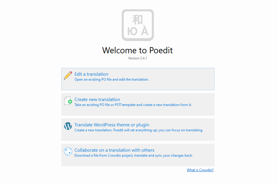
Opening a PO or POT file is very straightforward. Simply select the top option, find the file on your computer, and that’s it! As long as the file is formatted, you’ll see a list of all the strings it contains:
To translate the theme or plugin, you need to click on each available string in its original language, then use the Translation field at the bottom to enter your translation:
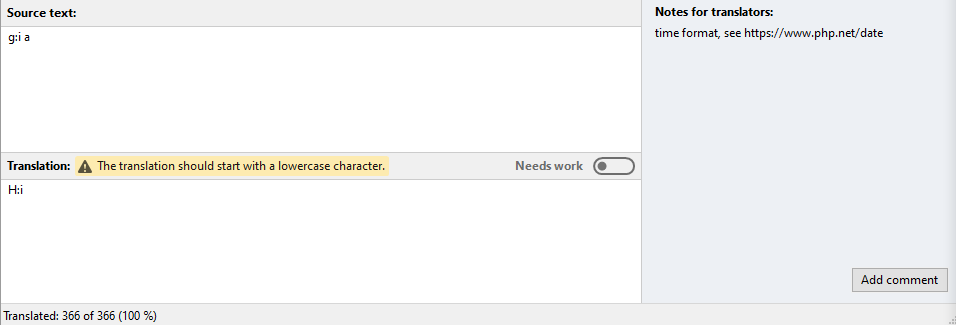
Notice that you can add notes for other translators using the Add comment button on the right. Poedit also includes suggestions from Microsoft Translator, which can help you localize strings. The free version of Poedit limits you to only 10 suggestions though, which run out pretty quickly in our experience.
As you progress through translating a PO file, you can save the changes you’ve made at any time. When you’re completely done with translating, you can open the file menu and select the Compile to MO option.
Languages directory
The languages directory is mapped to /wp-content/languages/themes and is intended for *.po and *.mo language translation files. Internationalized themes expect to find language translation files located in ../wp-content/languages/themes
The naming convention of language translation files for themes follow the pattern:
- Themes:
theme-name-{locale}.mo
Example:languages/themes/herome-en_GB.mo
So, after translating strings by using Poedit, you need to download and place the *.mo file in the directory mentioned above: ../wp-content/languages/themes.
l10n i18n localization Internationalization
| __() | Translates the specified text using a translation file and returns it for processing. |
| _e() | Translates the specified text using a translation file and displays it on the screen. |
| _ex() | Displays the translated string in the specified context. |
| _n() | Gets the singular or plural translation string that matches the specified number (1 comment, 2 comments). Localization function. |
| _nx() | Translates and returns the singular or plural form of a number based on the specified context. Similar to _n() , only taking into account the context. |
| _x() | Gets the translation of the specified string, given the specified context. |
| date_i18n() | Gets a localized date (translated to the current language) from the passed unix timestamp. |
| determine_locale() | Gets the current site locale (site language, such as en_US) that is appropriate for the current request. |
| esc_attr__() | Translates the specified string and processes it with the esc_attr() function . |
| esc_attr_e() | Outputs the translated text cleared by the esc_attr() function . |
| esc_html__() | Translates a string, replacing special characters in it with HTML entities. Returns text that can be displayed in HTML as HTML code. |
| esc_html_e() | Translates (locals) a string and clears it for display – replaces special characters in it with HTML entities. |
| get_locale() | Sets the global variable $locale and gets the current locale (site language index, for example, en_US ). |
| get_user_locale() | Gets the locale (translation language) of the current or specified user. |
| is_locale_switched() | Checks whether the locale (translation language) has been switched and whether the switch_to_locale() function has been used . |
| is_textdomain_loaded() | Determines whether the localization file for the specified domain (translation key) is loaded. |
| language_attributes() | Displays attributes for the HTML tag <html> with the values of the current language: lang=”ru-RU” |
| load_child_theme_textdomain() | Loads a child theme translation file (.mo) into memory for further work with it. |
| load_muplugin_textdomain() | Includes a .mo translation file for required plugins (mu-plugins) from the specified folder. |
| load_plugin_textdomain() | Includes a .mo translation file from the specified folder. Does not work with MU plugins. |
| load_textdomain() | Includes the specified translation file. |
| load_theme_textdomain() | Loads a theme translation file ( .mo ) into memory for further work with it. |
| number_format_i18n() | Converts a number (integer or fraction) into a format suitable for the current locale (site language). |
| switch_to_locale() | Allows you to programmatically switch the site language. |
| translate() | Gets the translation of the specified text. |
| unload_textdomain() | Unloads (deletes, cancels) the attached translation file. |
| wp_localize_jquery_ui_datepicker() | Localizes (translates) jQuery date picker script: jQuery UI datepicker. |
Full Site Editor
Full Site Editing functionality has been carefully crafted and optimized into our theme. Using the block editor and other Full Site Editor tools, you can shape and refine your website to perfection, giving you complete control over its layout and design.
The Full Site Editor gives you the ability to modify the layouts and design elements of your entire website, extending beyond the mere modification of individual posts or pages. It serves as an intuitive tool for creating and customizing web pages, templates, and themes without necessitating any alterations to the underlying source code.
A Full Site Editor can be used to accomplish the following tasks:
- Create and modify website layouts using blocks and global styles;
- Customize page and post templates to suit your needs;
- Change the appearance and arrangement of website elements, such as header, footer, sidebar, etc.;
- Apply changes across the entire website or specific pages and sections as desired.
The Full Site Editor offers a more flexible and intuitive approach to visually editing and customizing your website, eliminating the need for manual coding.
The theme comes with pre-configured templates, including:
- 404
- Archive
- Product Catalog
- Category
- Front Page
- Index
- Page
- Product Search Results
- Search
- Single
- Single Product
- Single Post with Rightbar
- Single Post with Rightbar and Preview
- Tag
- Products by Attribute
- Products by Category
- Products by Tag
- Blog Classic
- Blog Grid With Rightbar
- Blog Subcategory
- Blog Subcategory With Rightbar
For comprehensive information about all the features of Full Site Editing (FSE), you can refer to the official WordPress documentation.
Header
The upper section of a web page, which includes the logo, site title, main navigation menu, and other essential elements, is commonly referred to as the “Header.” It holds a pivotal role in website design as it appears on every page, serving as the initial visual contact for users upon visiting the site.

The Template Part Header incorporates the following Gutenberg blocks:
- Site Logo
- Site Title
- Navigation
- Social Icons
- HeroCode Phone
- HeroCode Search
You can customize the Header according to your unique design and website goals. To achieve this, the entire set of Gutenberg blocks available in our theme can be utilized. This allows for a wide range of creative possibilities to create a visually captivating and functional Header that aligns perfectly with your website’s vision and objectives.
HeroCode Theme Addons
This indispensable plugin provides installation of necessary plugins, and swift installation of demo content. A Theme Panel tab appears in the Dashboard control panel, offering easy access to theme settings and configurations.
Theme Customizer
To utilize the theme, it is necessary to configure your website beforehand. To do so, please navigate to the section Appearance > Customize and customize Site Title, Tagline and Favicon. These settings are responsible for identifying your website.

Site Title
If you haven’t uploaded a logo and have selected the option “Use site title as logo,” the text entered in this field will be displayed as the header instead of a logo. Furthermore, this text will be used as the website title displayed on the tab of your browser.
Tagline
By default, the slogan is used if no logo image is selected and the option “Use site title as logo” is enabled.
Favicon
The site icon (favicon) is utilized as the icon for your website in browsers and applications. Icons should be square and have a minimum width and height of 512 pixels.
Gutenberg blocks Site title and Tagline
You can utilize the standard Gutenberg blocks, namely the Site Title and Site Tagline blocks, when creating your own template.

Footer
The lower section of a web page, known as the “Footer,” is situated below the main content of the website. The Footer encompasses information that is consistently displayed on all pages of the website. It serves the purpose of providing additional navigation options, contact details, links to privacy policies, copyright notices, and other significant information.
The Footer assists users in quickly accessing additional information about the website, contacting the site owner, or performing other actions. It is also an integral part of website design, and its content and style can be customized to align with the overall design and objectives of your site.
HeroCode Blocks
Our team has developed a set of Gutenberg blocks to enhance the functionality of the theme. This extension also enables you to configure the responsiveness of your website and implement the most creative ideas you have in mind.
We are actively continuing to develop new blocks and expand the functionality of existing ones. You can obtain more detailed information about each block here.
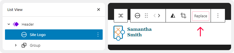
Logotype
You can modify the logo by accessing the following section: Template Part, then go to WP Dashboard > Appearance > Editor > Template Parts > Header.

Click on the Site Logo block and proceed to replace the image by clicking on the “Replace” button.
HeroCode Testimonials
We offer a simple and convenient method for collecting feedback from your clients. By utilizing dedicated Gutenberg blocks, you can customize a feedback form and place it on any page of your website. Moderated reviews can be displayed as a beautiful list in any template of your website.

HeroCode Timecheck
We offer a user-friendly plugin for collecting inquiries on your WordPress website. Automating your website is made easy with the specially designed user-friendly interface.
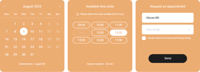
You can find more detailed information about the capabilities and settings of HeroCode TimeCheck here.
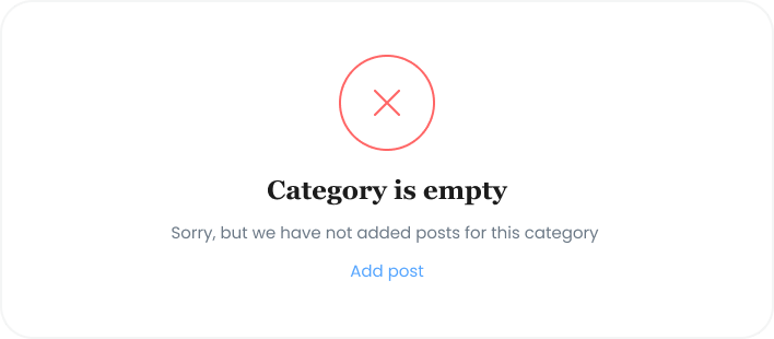
Empty Template
Whenever there are no posts on an archive page, a category page, a tag page, or a search results page, this element will be used. Like other templates, this template can be customized and modified according to your specific needs and objectives.
Contact Form 7
You can customize and modify this template according to your specific needs and objectives using the Contact Form 7 plugin. The form supports Ajax submission, CAPTCHA usage, spam filtering with Akismet, and other features. Please visit this link for further information.
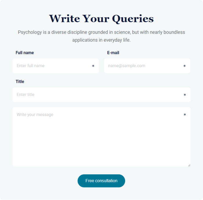
In accordance with general data protection regulations, it is recommended that you ensure compatibility of your forms to protect personal data. Do not forget to include a checkbox stating “I agree…” to obtain users’ consent for processing and storing their information.
Styles
This guide illustrates how to use styles to ensure a cohesive design throughout your website. Styles allow you to adjust various colors, typography settings, and layout parameters.
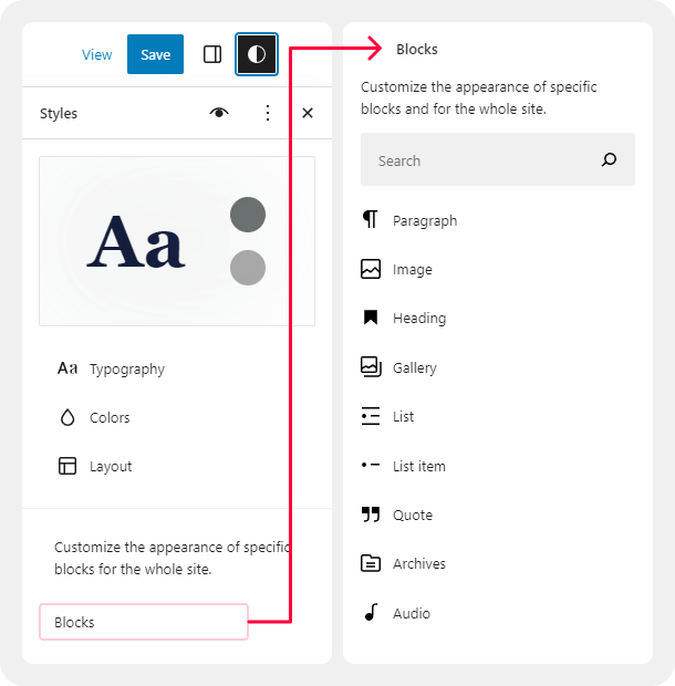
Find the Styles Settings
While editing your site, find the Styles option in the upper right corner of the screen. The icon looks like a circle with one white and one black half, as shown in the image on the right.
The full steps to locate the Styles panel are:
- Visit your site’s Dashboard.
- Go to Appearance → Editor.
- Choose a template and begin editing it.
- Select Styles from the right-side menu.

In the Styles settings, you will see the following options:
- Browse styles
- Typography
- Colors
- Layout
- Blocks
Each of these options are explained in the following sections of this guide.
Sidebar
The template with a sidebar is applied to specific pages of the website.
The sidebar is a vertical area located beside the main content on a web page. It represents additional space that contains stylized components assembled from standard Gutenberg blocks. By installing the demo content, you will receive a sidebar with blocks such as Search, Tag Cloud, Recent Posts, Categories List, and a Banner with a button.
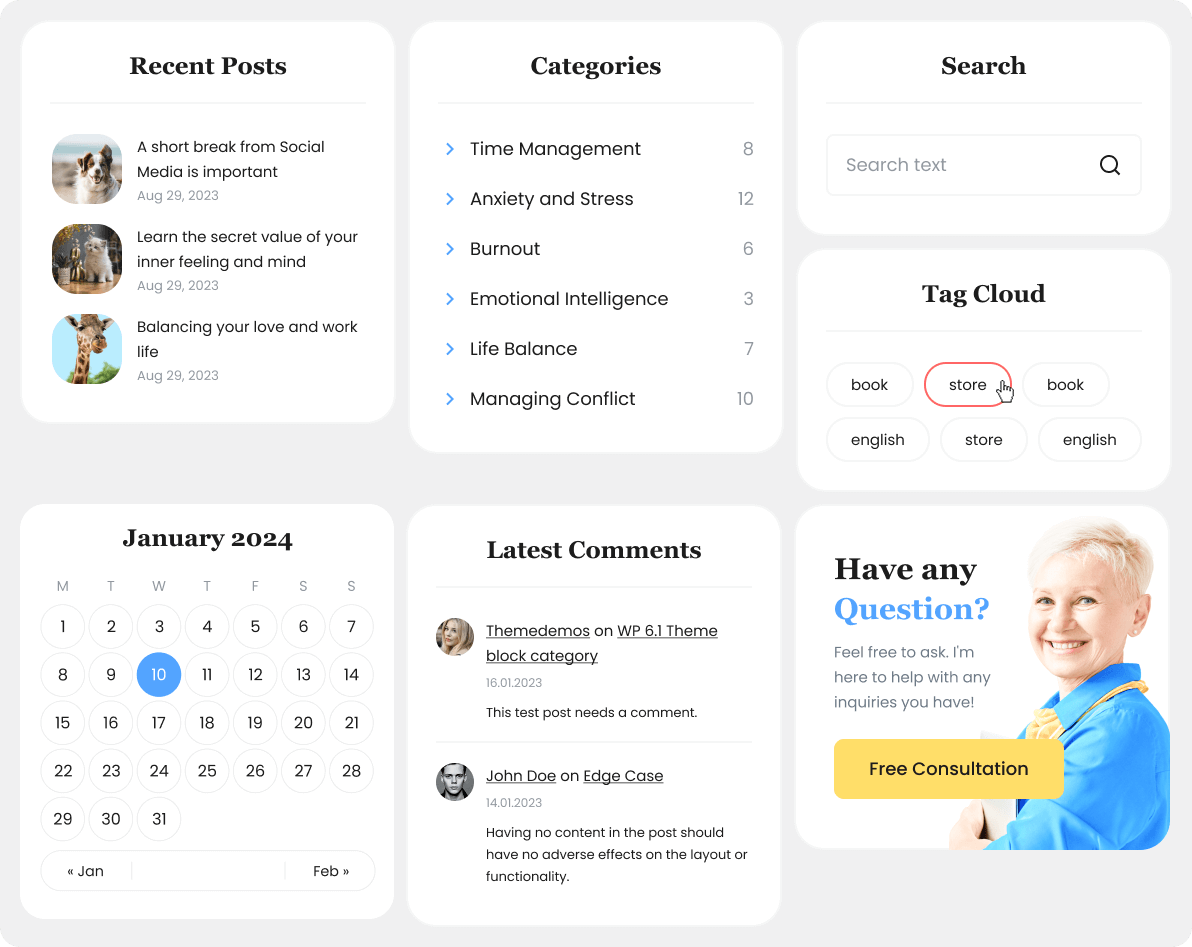
The same sidebar will be displayed on different pages of the website. When you configure the sidebar in one place, all the changes will be applied throughout the site.
WooCommerce
WooCommerce is the leading e-commerce plugin in the WordPress industry. Our theme is compatible with this powerful tool, allowing you to turn your website into an online store with just a few clicks. Simply install this plugin and enable it to create a set of pages for displaying product categories, individual products, and other elements. Then, all you have to do is add products to your site.

We recommend that you explore the documentation provided by the WooCommerce developers. It will help you create an efficient online store. Here is a list of useful links that will assist you in the process of building and growing your store:
- Документация – Official documentation
- Free and premium extensions – powerful toolkit that offers a wide range of tools and features to enhance your online store
- iOS and Android app – this application provides you with complete control from your phone.
Browse styles
Customize the appearance of specific blocks for the whole site by choosing browse style in component panel of the template. In there you will able to choose a variation of your site appearance on one click. At the present time we provide you light (default) and dark mode for styles.

Yoast SEO
Yoast SEO – is a popular search engine optimization (SEO) plugin for the WordPress platform. It offers a wide range of tools and features that help you optimize your website for better rankings in search engines like Google. Yoast SEO provides keyword analysis, meta tag creation, page title optimization, social media card management, sitemap generation, and much more. The plugin is a powerful tool for improving the visibility of your website and attracting more organic traffic.
Our theme utilizes Yoast SEO’s breadcrumbs feature.
Breadcrumbs are a navigational element that displays the path from the main page to the current page. They represent a hierarchical structure of links, enabling users to easily navigate through the site and understand its structure.
Typography
Use the Typography settings to manage the appearance of the text used throughout your site.
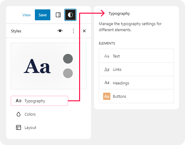
You can adjust settings separately for
- Text
- Links
- Headings
- Captions
- Buttons
The options found in Typography include:
- Font allows you to select a font family to apply to the text.
- Size allows you to set the size of the font. You can choose from a set of default font sizes or set a custom size in REM, PX, or EM using the slider button above the size selections.
- Appearance changes the text’s weight (from thin to extra bold) and inclination (regular or italic).
- Line height sets the spacing above and below the text. (If you select zero, be sure to check your site on mobile.)
For more, visit our dedicated guide to Typography settings.
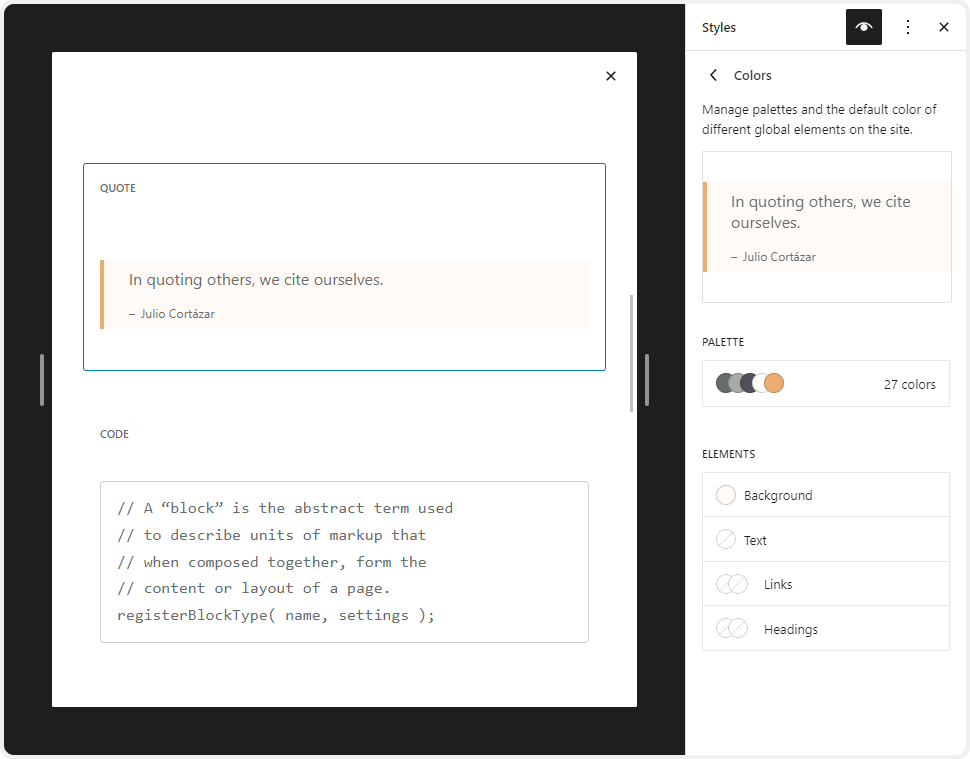
Colors
- Open Styles settings
- Select Colors.
- Select Palette to choose your site’s default colors or choose from the following elements on your site:
- Background
- Text
- Link
- Heading
- Buttons
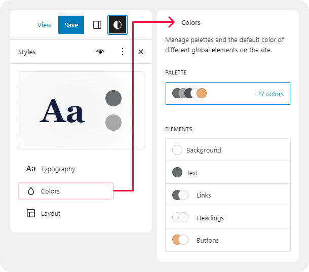
You can find more information on working with colors in the article “Change Your Site’s Colors Using Styles“.
Layout
Use the Layout settings to control the width of your site’s content area, add padding, and adjust the spacing between blocks.
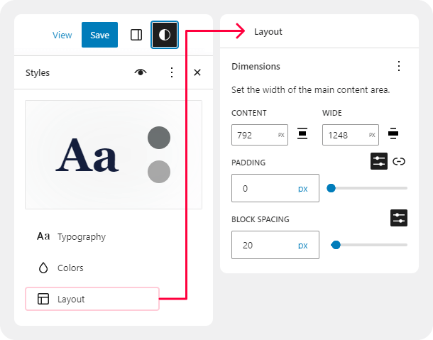
For more, visit dedicated guide to Dimensions settings.
Blocks
In the Styles panel, click on Blocks to customize the appearance of specific blocks across your entire site.
Here, you will see a list of all the blocks you can customize at a site-wide level. Choose a block to see the available options for that block.
The changes you make to blocks using Styles will affect every block of that type that you have added to your site, unless you have customized a block individually. For example, if you added a Buttons block to your Contact page and set it to have a yellow background, your change in Styles won’t override that yellow color. However, if you inserted the Buttons block on your Contact page and did not change the color from the default, it will change to the color you set here in Styles.
WordPress Information
To install the theme, you need to have a working version of WordPress installed. Below are some useful links where you can find information about WordPress:
- Basic information about WordPress.
- WordPres lessons – Knowledge base for novice WordPress users.
- PHP functions – This page contains detailed information about WordPress PHP functions and numerous examples of their use.
- Site Editor tutorials
Theme Requirements
The theme requires WordPress version 6.0 or higher, as well as PHP version 7.4 or higher. For third-party plugins, additional requirements may apply. For example, WooCommerce may require PHP 7.4 or higher, and so on.
Block themes can be resource-intensive and may require adequate server resources to ensure optimal performance. It is recommended to contact your hosting service provider to ensure that the PHP configuration on your server meets the following requirements:
max_execution_time 600memory_limit 128Mpost_max_size 32Mupload_max_filesize 32M
If you are using a hosting service with limited resources, you may encounter issues when installing demo data.
Theme Installation
There are two methods available for installing the theme
WordPress admin panel
- Please log in to the WordPress administrator panel.
- Navigate to Appearance > Themes and click on Add New, then proceed to upload the theme.

- Select the folder named herome.zip and click the Install Now button.
- After successful installation, press Activate or go to Appearance > Themes and click the Activate button to activate the newly installed theme.

FTP
- Access your web server using FTP client software.
- Unzip the herome.zip file and utilize ONLY the extracted /herome theme folder.
- Upload the extracted herome theme folder to /wp-content/themes directory.
- Navigate to the Appearance > Themes tab and activate the theme.
Plug-ins Installation
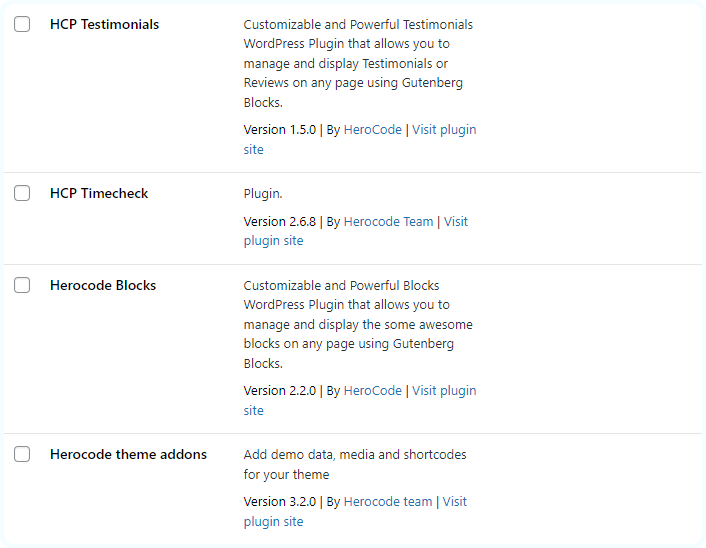
Below is a list of plugins included with the theme.
Some of these plugins can also be installed from the WordPress.org repository.
- HeroCode Theme Addons (mandatory)
- HeroCode Blocks
- HeroCode Testimonials
- HeroCode Timecheck
- Contact Form 7
- WooCommerce
- Yoast SEO
- MC4WP Mailchimp
- AddtoAny Share Buttons
In the Plug-ins section of this document, you can find a detailed description of the plugins created by the HerocCode team.
Required plugins
It is necessary to install the corresponding plugins to fully customize the theme’s appearance and functionality as on the demo page. After installing and activating the theme, you have to install and activate the following required plugins to have correctly working site:
- HeroCode Theme Addons
- HeroCode Blocks
- HeroCode Testimonials
- HeroCode Timecheck
The HeroCode Theme Addons plugin is the only plugin necessary for the theme to function properly. The remaining optional plugins are not mandatory for the theme. HeroCode Theme Addons will allow to install all required and recommended plugins.
Plugins’ customization
To install the recommended plugins, please navigate to the section Theme panel > Plugins.

Please indicate the plugins you would like to install or activate. Click Install & Activate. The installation may take a few minutes. Please be patient and refrain from refreshing the page.
If you are using hosting with limited resources, it is recommended to install plugins one by one. You may need to install only the essential plugins, such as HeroCode Theme Addons, and disable the rest. Otherwise, it can significantly increase memory usage, which may lead to issues of concern.
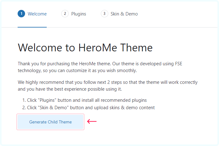
Child Theme
A child theme should be installed if you want to modify theme files and functions. This will ensure that your theme settings are preserved after updates.
A child theme can be installed from the tab Theme Panel > Theme activation. After clicking the Generate Child Theme button, the child theme will be automatically installed and activated.
Child theme functions
In the child theme, there is a separate functions.php file available. You can utilize this file to copy modified functions from the parent theme’s functions.php or register new functions.
By editing the style.css file in the child theme, you preserve the parent theme’s core functionality while changing the design and appearance of the website.
When copying files from the parent theme to the child theme, ensure to maintain the original folder structure. Create the corresponding folders and ensure that the file path is the same as in the parent theme.
Demo Content
Our theme provides a simple demo data installation feature. This allows your website to look exactly like the demo version of the theme.
Before installing the demo data, please make sure
- The theme is activated (Appearance > Theme)
- All recommended plugins are installed (Theme panel > Plugins)
- Ensure that your hosting meets the minimum requirements
- Have sufficient free space on your hosting (at least 100MB)
Our theme provides support for RTL (Right-to-Left) text direction (compatible without RTL demo content). Before installing the demo content, please ensure that you have selected the correct language in your WordPress settings (Dashboard > Settings > General > Site Language).
Demo content import
Go to Theme panel > Skin & Demo. First, determine the desired style of your website, which will include accent colors and suitable fonts for headings, main text, links, and buttons. If you are installing demo content, it will be unpacked according to the selected skin.
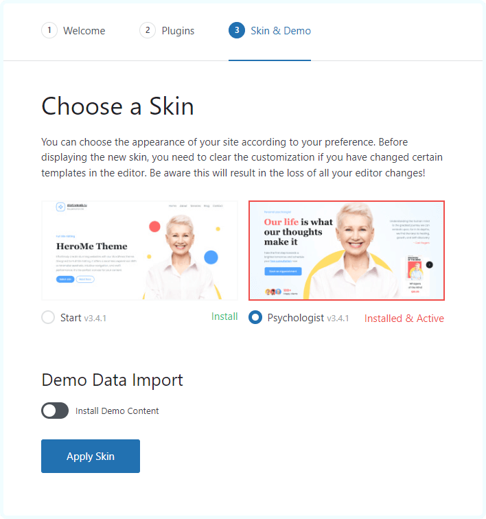
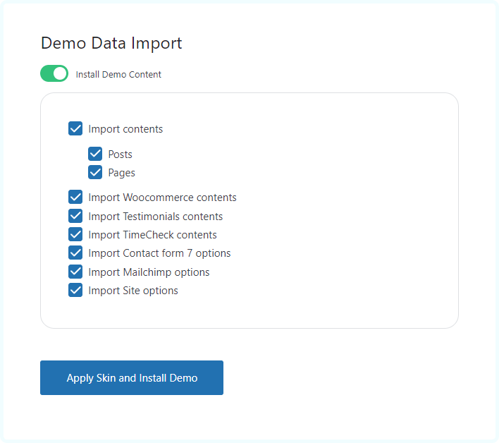
If you wish to obtain a complete copy of the demo website, you should enable the Install Demo Content feature and configure the relevant parameters. All media files, articles, categories, tags, products, theme settings, and plugin configurations can be imported with this tool.
Single pages will be imported in a similar format to our demo version, but they will have blocks that need to be configured. You need to replace the categories/post IDs from the demo version with your own ones.
When unpacking the demo content, ALL OLD DATA WILL BE DELETED, and you will receive a new set of posts, pages, and menu items.
If the installation of the demo data is stuck and you see an “Oops! Something went wrong.” message, please contact your hosting service provider to ensure that your server configuration meets the theme’s requirements. Otherwise, please submit your request to our support department.
Alternative way to import demo content
If you have problem with installation of demo content in your site using Theme Panel, you can use alternative way to install it.
Important!
It is necessary to install all required plugins before importing demo content.
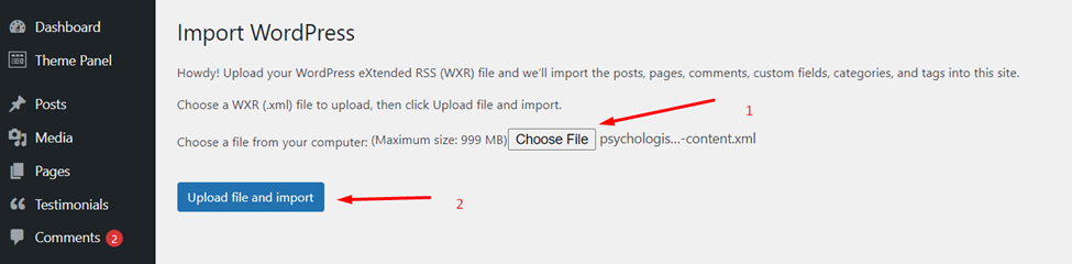
Step 1: In your website WordPress dashboard, go to Tools à Import and install built-in WordPress importer.
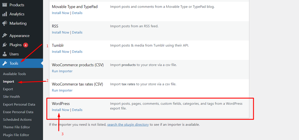
Step 2: After installation of WordPress Importer, click Run Importer.
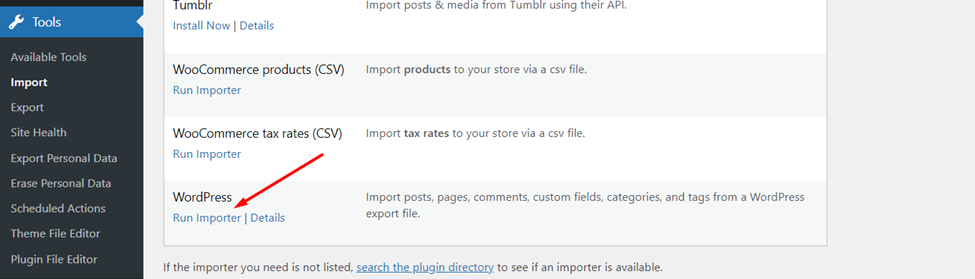
You will see Import WordPress page where you can choose file what to import. Choose file with .xml extension and click Upload file and import button. You have to unzip downloaded *.zip file and use .xml file for importing demo content.
Step 3: On the next page, check the checkbox Import Attachments (download and import file attachments) and click submit.
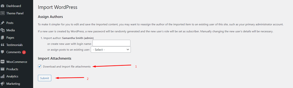
That’s it. After import is completed, you will see the message “All done. Have fun!”
Support Policy
The Herocode team provides support only for questions related to the functionality of the HeroMe theme.
We do not provide support for third-party plugin integration or any other compatibility issues that may arise. However, there is an exception that applies only to the plugins that we have developed and integrated ourselves.
There are several ways to submit a question to technical support::
- Contact us using our website’s contact form.
- Additionally, you can ask a question in the online chat at herocode.pro.
- Email: Send an email to our support team at support@herocode.pro
Our working hours are from Monday to Friday, from 9 am to 6 pm Central European Time (CET). We strive to respond to inquiries as quickly as possible, typically within 24-48 hours, often even faster.
Some questions may already have answers on our website in the FAQ section. Before submitting a new request, please make sure it is related to the functionality of the theme and not the standard functionality of WordPress. Please review the available resources before reaching out to the support team.
Theme Update
We recommend performing the update if you have received a notification about a new version of the theme. To view the list of changes, please go to the relevant section.
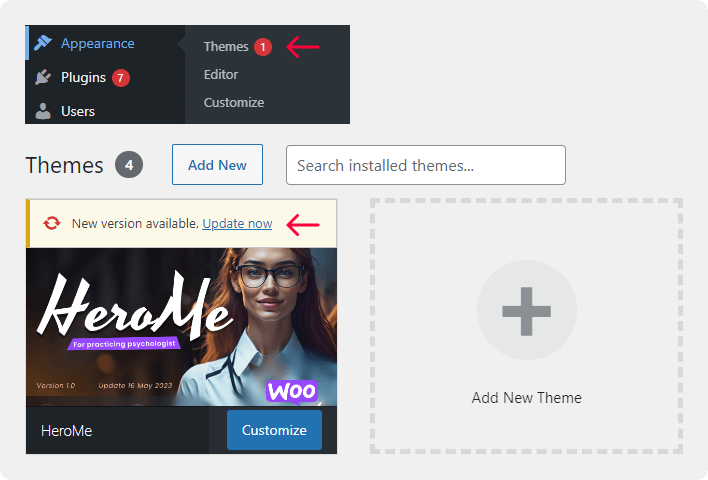
Before starting the update process, we recommend creating a backup of the folder containing your current theme. Please download and keep a copy of this backup on your local computer until you are confident that the new version of the theme is functioning correctly!
Go to Dashboard > Updates, In the Themes section, select the HeroMe theme. Click on “Update Themes” and wait for the theme to be updated.
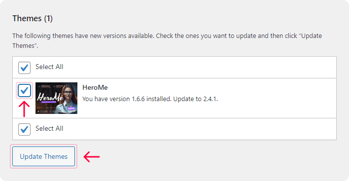
To ensure the proper functioning of the theme, please update the plugins if you see a notification indicating a newer version is available.
Third-party Extensions
Unfortunately, we are unable to provide support for third-party extensions. If you have any questions, please contact the author of the specific extension for assistance.
Bundled Plug-ins
In order for the theme to function properly and to provide all of the features it offers, specific plugins are incorporated. Please refer to the list of included modules for more information.
A plugin is an additional component that offers functionality and features beyond a typical WordPress installation. Theme authors may choose to include certain plugins within their item to add these special functions and features to the theme package.
Herocode plugins are integral parts of this theme and cannot be resold.
Articles & Video Tutorials
For further information about the theme’s functionality, we recommend exploring our video tutorials and articles:
Current page is under construction. This page will continue to be updated.
MC4WP Mailchimp
Mailchimp is a newsletter service that allows you to send out email campaigns to a list of email subscribers. It is free for lists with up to 500 email subscribers, which is why it is the newsletter-service of choice for thousands of small businesses across the globe.
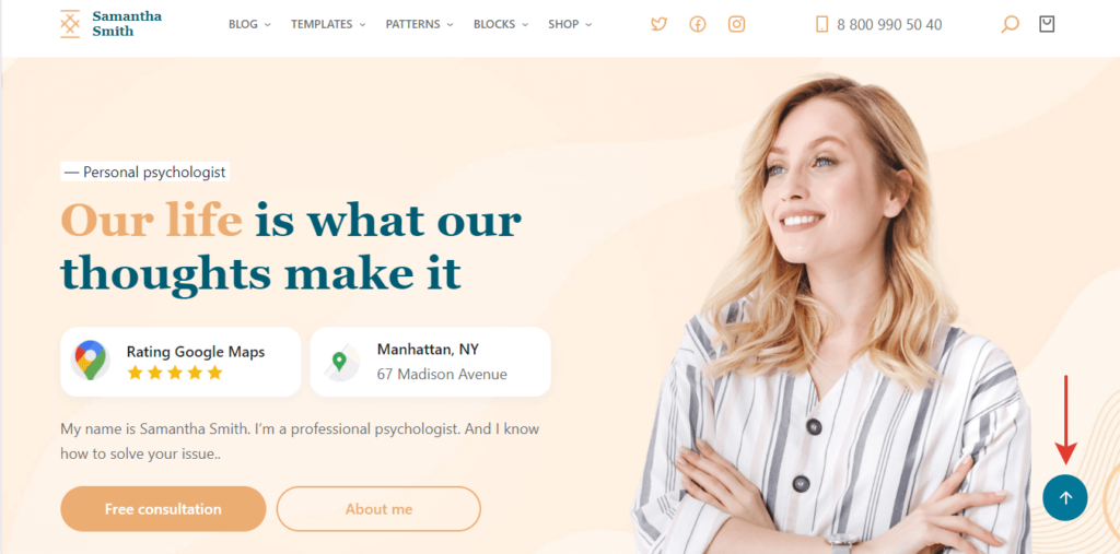
Scroll Back To Top Button
How to make the “Up” button:
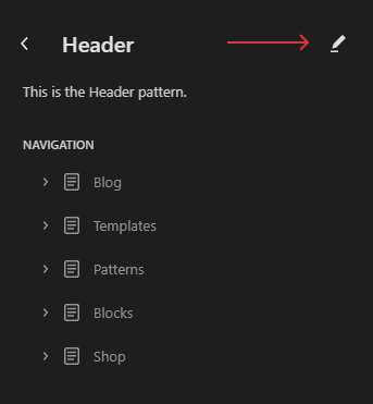
- Go to Editor

2. Choose Patterns > Header

3. Edit it
4. Turn on “List View”. Choose the Group section and set a unique HTML Anchor for it. For example, “top”.

5. Go back to Patterns и edit Footer
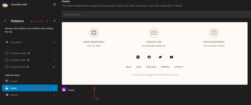
6. Add Adaptive Position section and insert Herocode icons in it
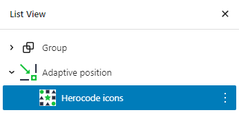
7. Customize the visual appearance with Herocode icons and add link into HTML Anchor which we inserted in the Header
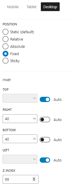
8. For Adaptive Position section set the following settings
- Position: fixed
- Top: Auto
- Right: 40px
- Left: Auto
- Bottom: 40px
- z-index: 99
9. This results in a button that allows the site to scroll up when clicked